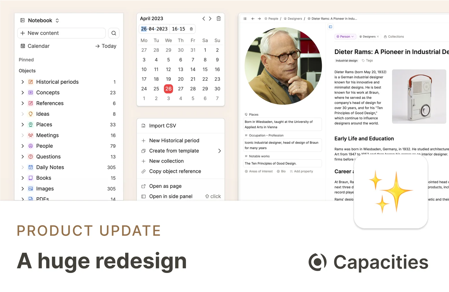
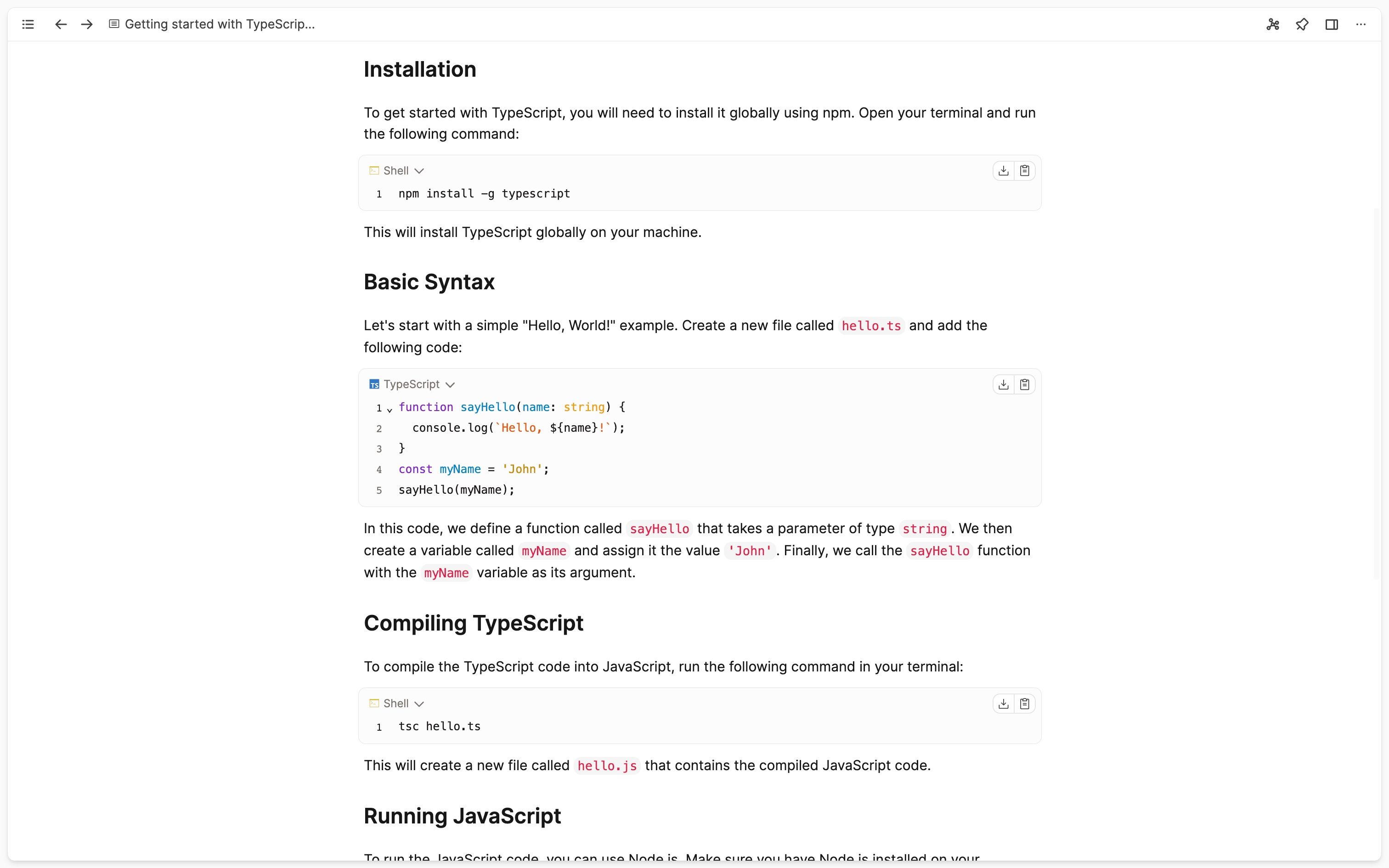
This update is a major redesign with a new design system and a huge polishing effort with over 50 resolved tickets. So, it does not bring any big feature additions, but countless improvements across the board. We hope you'll like it!
Redesign and new design system
The app has reached a level where we think it makes sense to unify the design. We want to make it easier and more intuitive for you to use Capacities. Therefore, we established a design system and adapted and reworked all areas of the app. This will not only make it easier for you to use the app but will also help us ship faster and with more consistency in the future.
While many changes involve font sizes, spacings and color changes, there are also some rearrangements of buttons, menus and options to other places.
Here are the most notable changes:
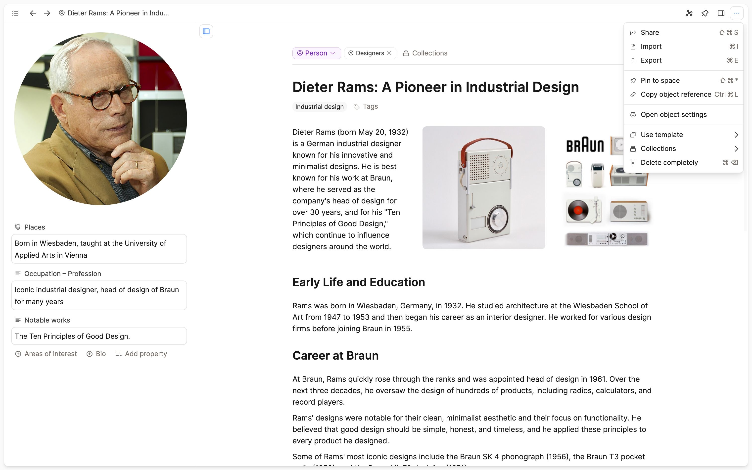
- Object menu: For all actions related to an object, we're introducing a unified object menu, marked by three dots. You will find it in the top right in the main header for the currently opened object.
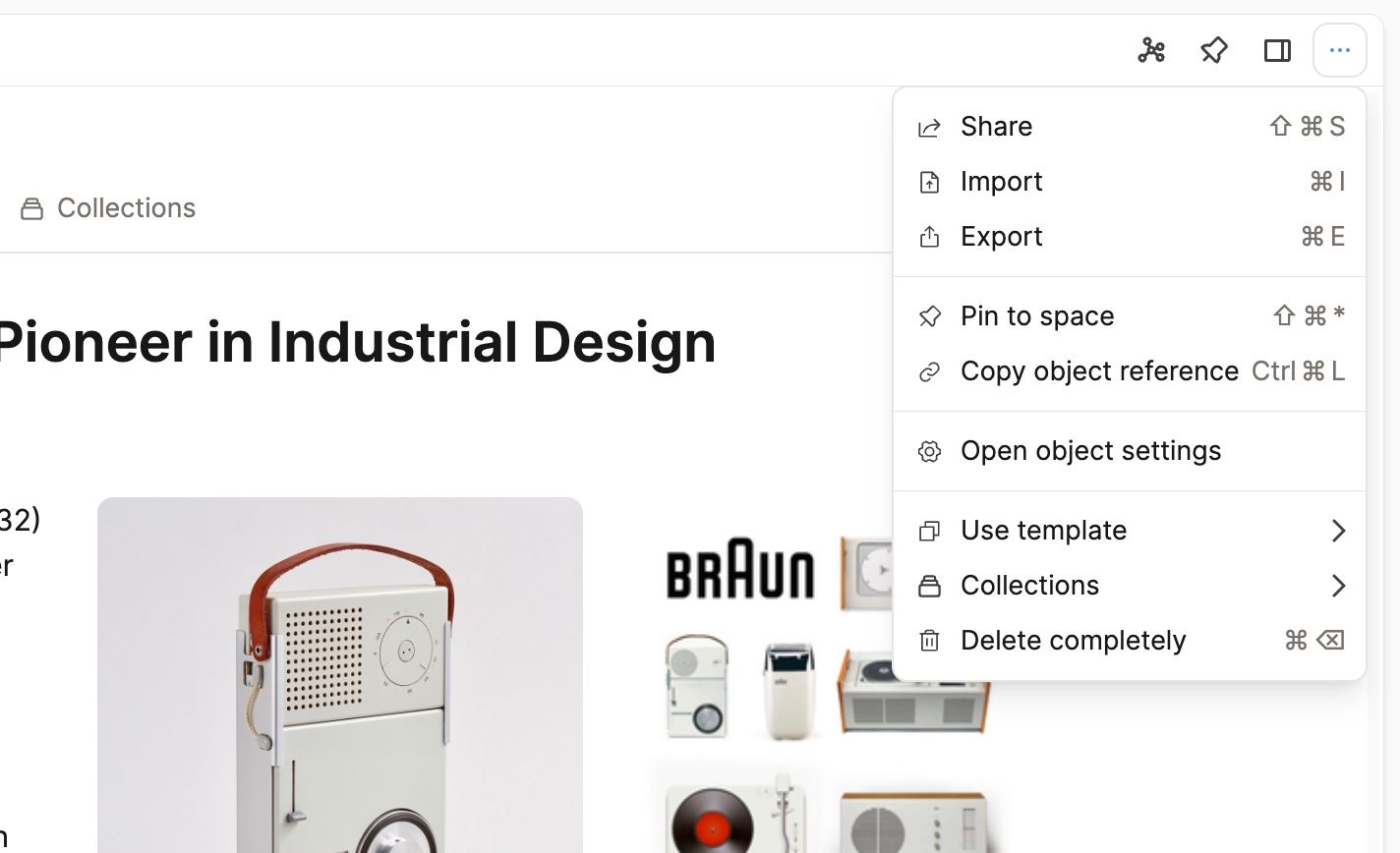
But you will also see it for objects in the left sidebar, next to linked or embedded objects, in the backlinks view, and in other data views, such as an object in a collection or on a tag page.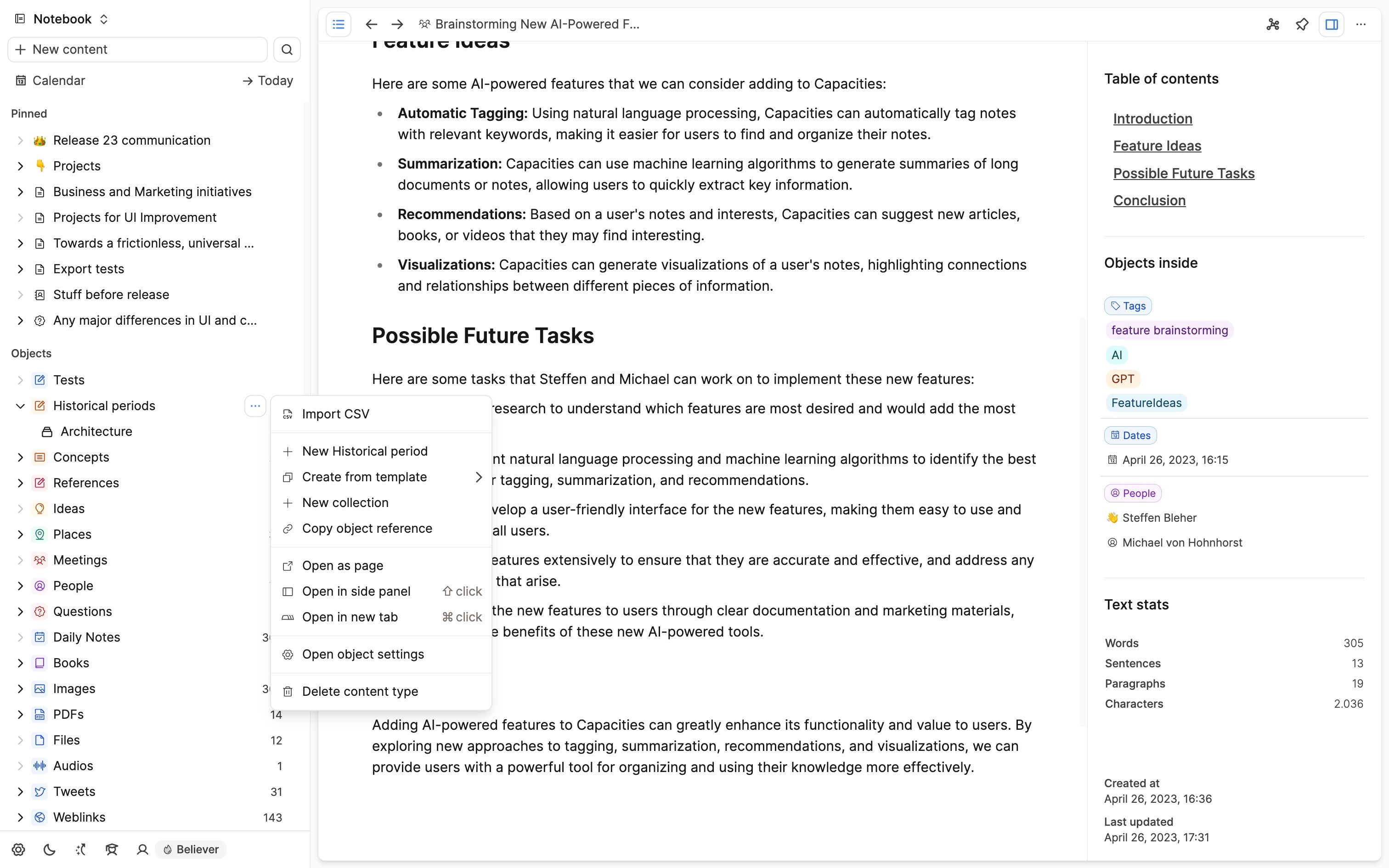
- Redesign of the right sidebar: The "Actions" section that was previously part of the right sidebar has also moved to the object menu. This means that the right sidebar is now only used for additional information, such as the table of contents, linked objects, and text stats.
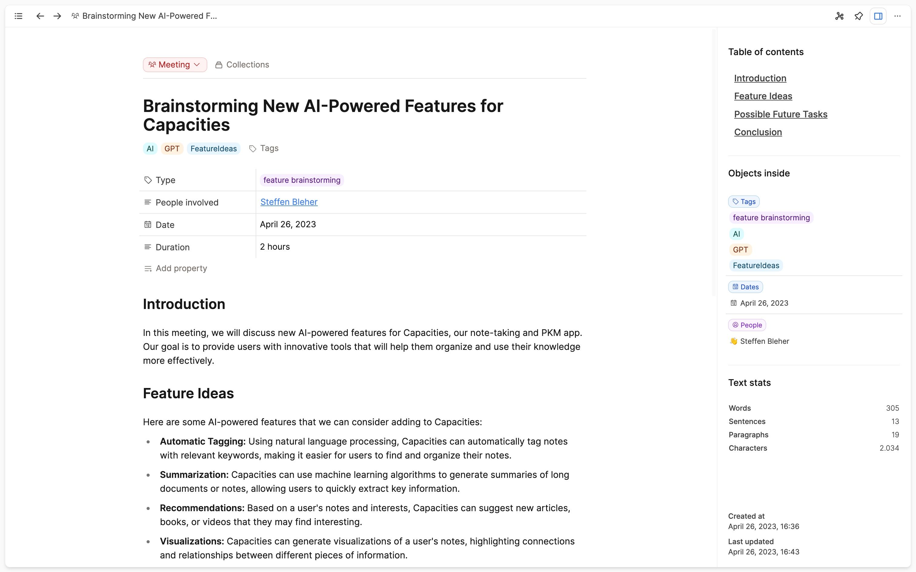
In addition, the right sidebar has visually moved into the main content window to better reflect the relationship with the main content. - Unified layout button on a page: All buttons to adjust and change layout related options of the current page are now in the same place – right above the title. This includes the button to toggle the wide layout, the button to toggle the wide cover image, and buttons to add a description, an icon or a cover image.

- Rework of page layouts (for believers): With the right sidebar moving inside the main content window, we've also reworked the page layouts. We've moved the sidebar containing properties to the left for all layouts because the right sidebar now takes the space on the right. The encyclopedia layout had two sidebars, one with the properties on the right and one for additional info on the left. Since there was not a huge difference between the left sidebar and what is now shown in the right sidebar by default, we've decided to remove the left sidebar in the encyclopedia layout. This means, that the property sidebar is now shown on the left for all layouts.
Encyclopedia layout: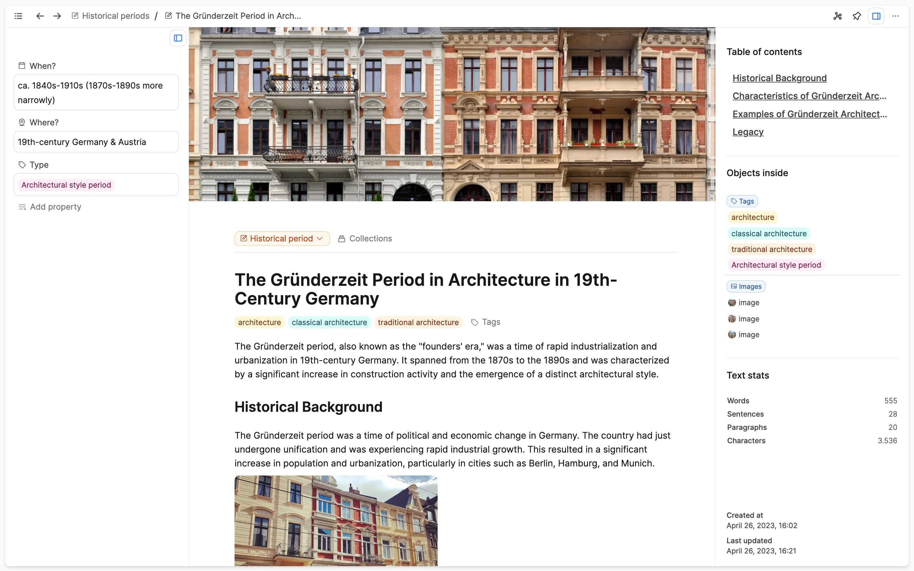
Index card layout: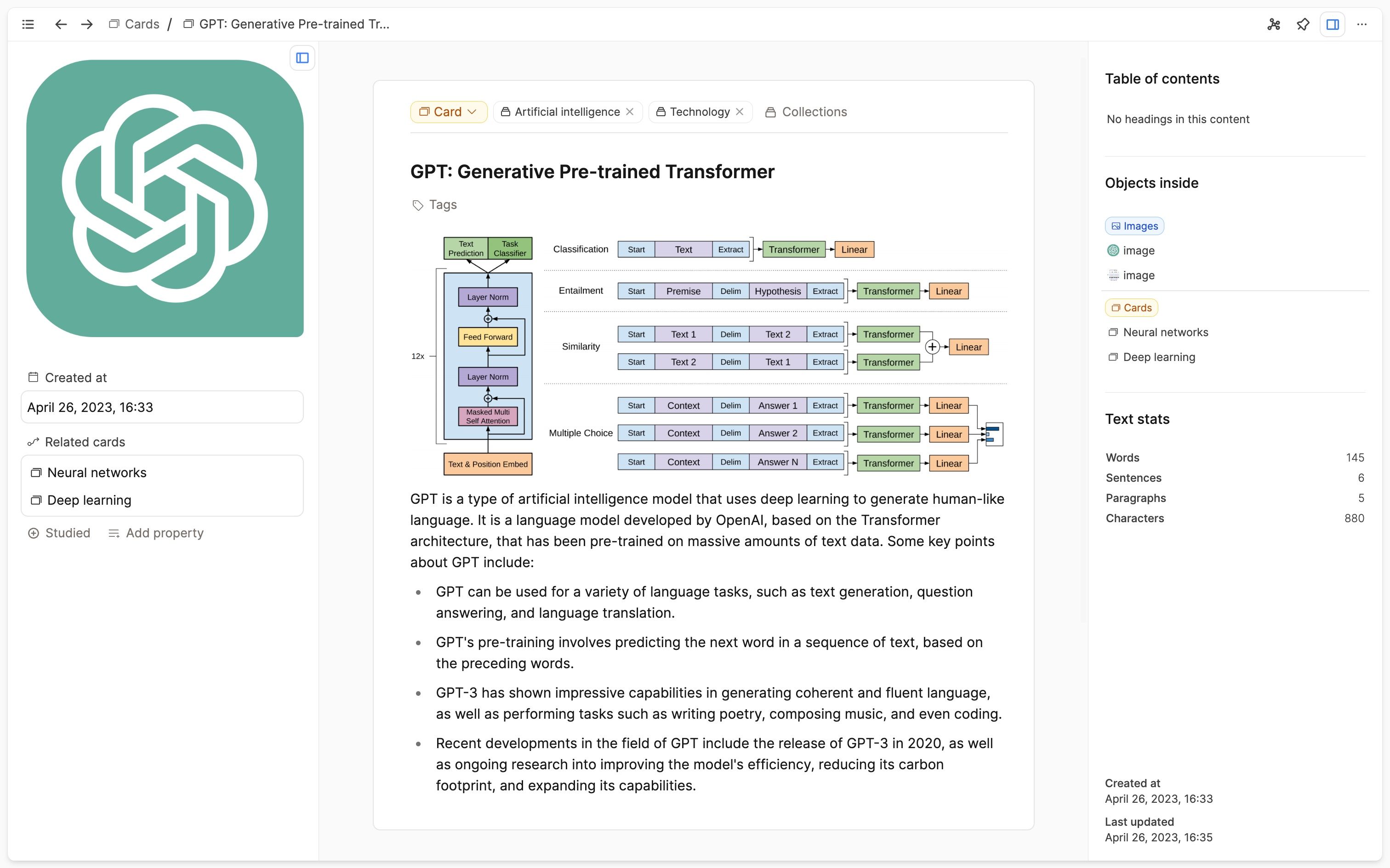
Profile layout: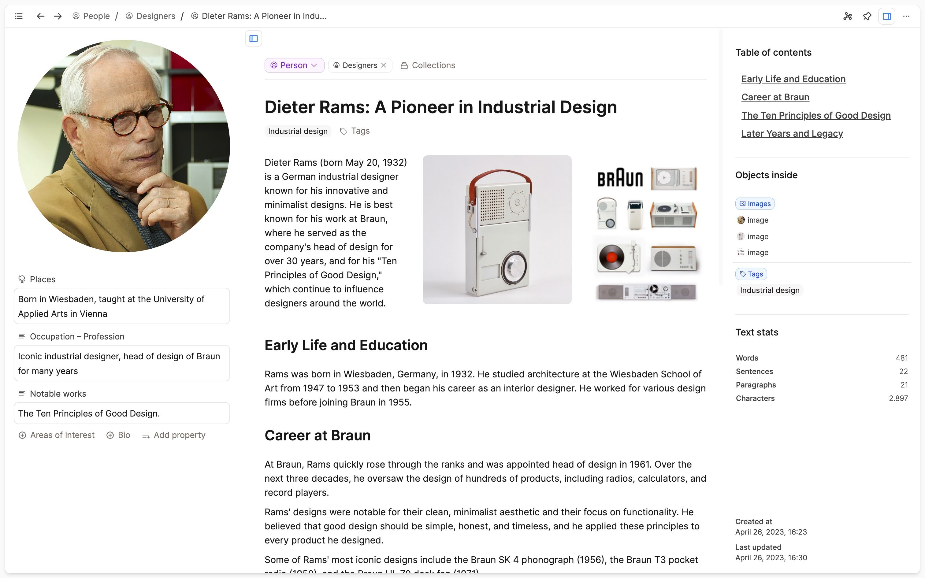
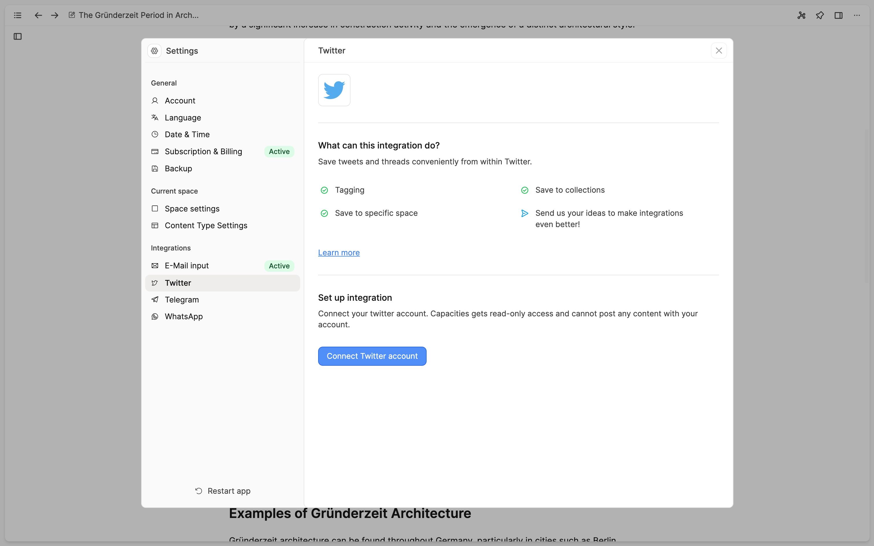
All layouts except for index card now support a wide layout mode and a wide cover image mode. - Redesign of settings: We've redesigned the whole settings to make them more consistent and easier to navigate.
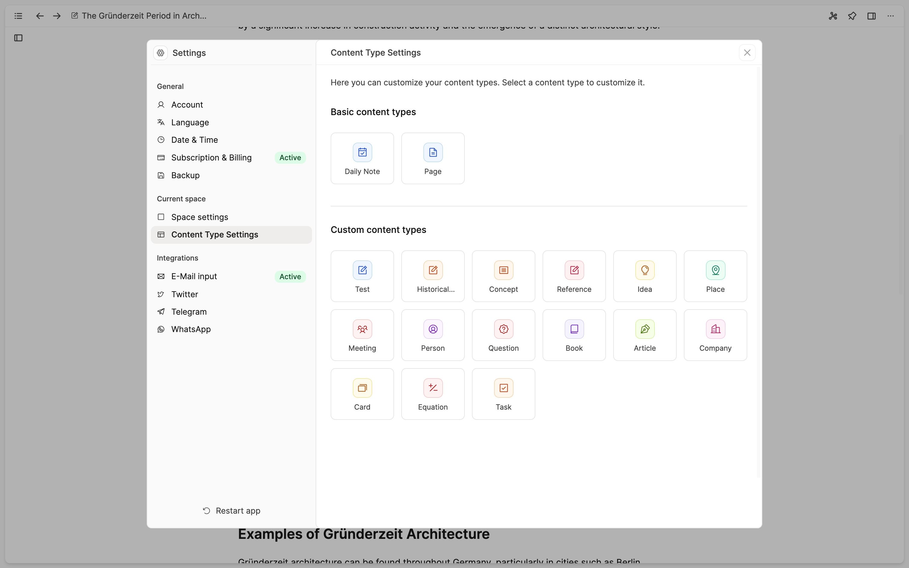
A sticky navigation header now shows you what setting you're in and lets you navigate back if you're on a nested settings page.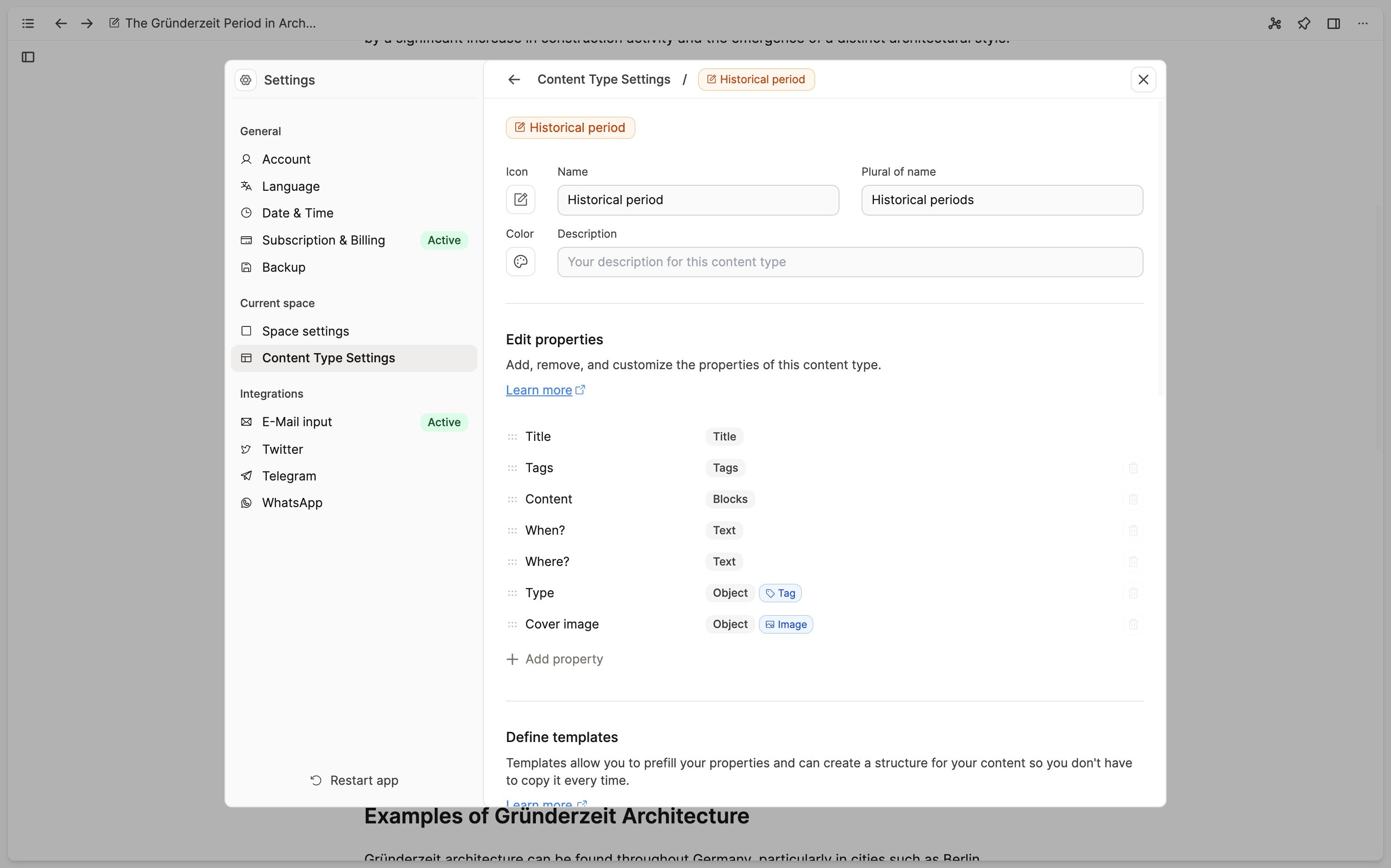
We've also added a sticky confirmation step when you change settings that are not easily reversible which blocks closing the settings before you confirmed or discarded the changes.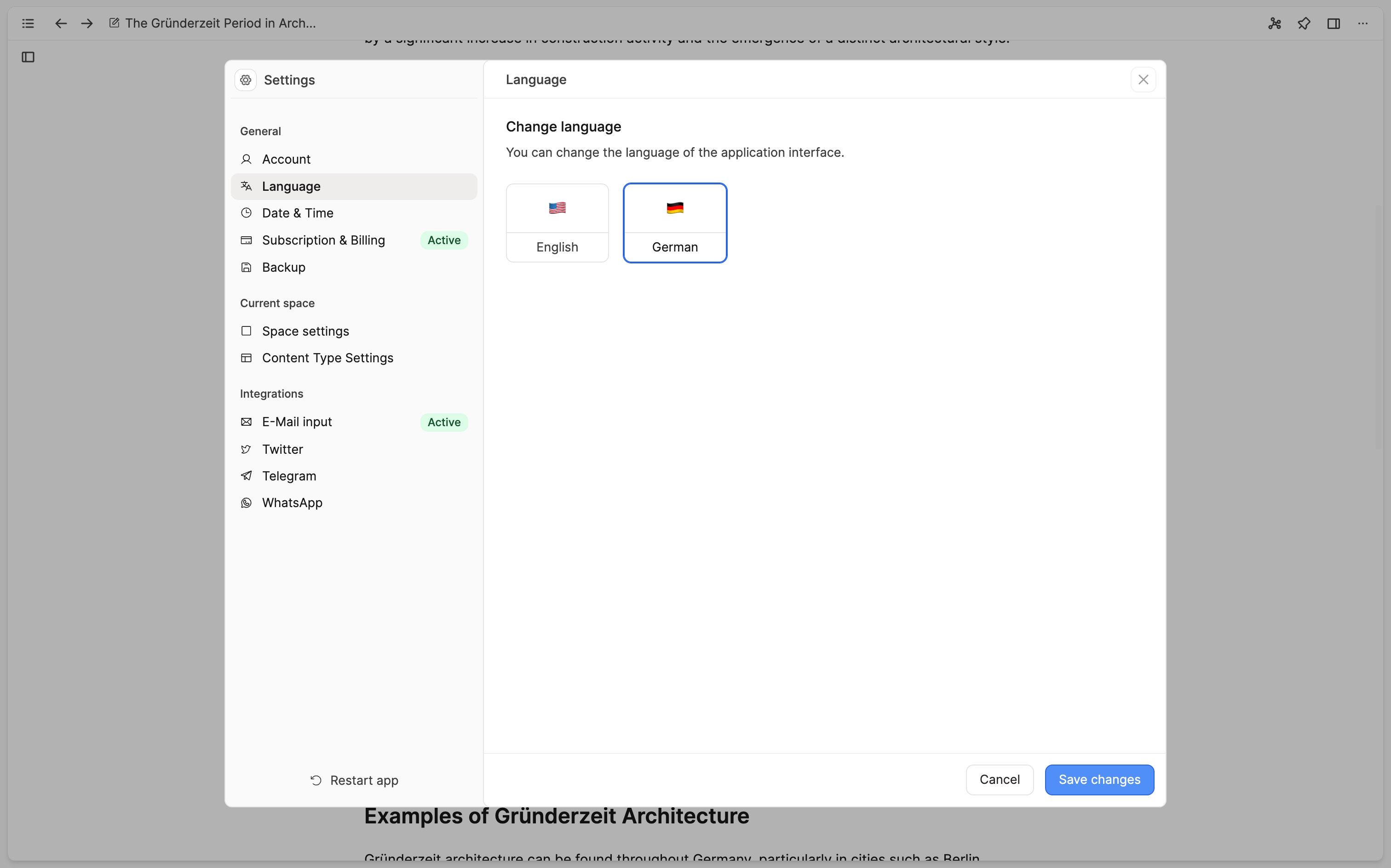
- Dark mode and shortcut cheat sheet moved to left sidebar: We've moved some buttons from the main header to the left sidebar. This includes the button to toggle dark mode and the button to show the shortcuts cheat sheet,
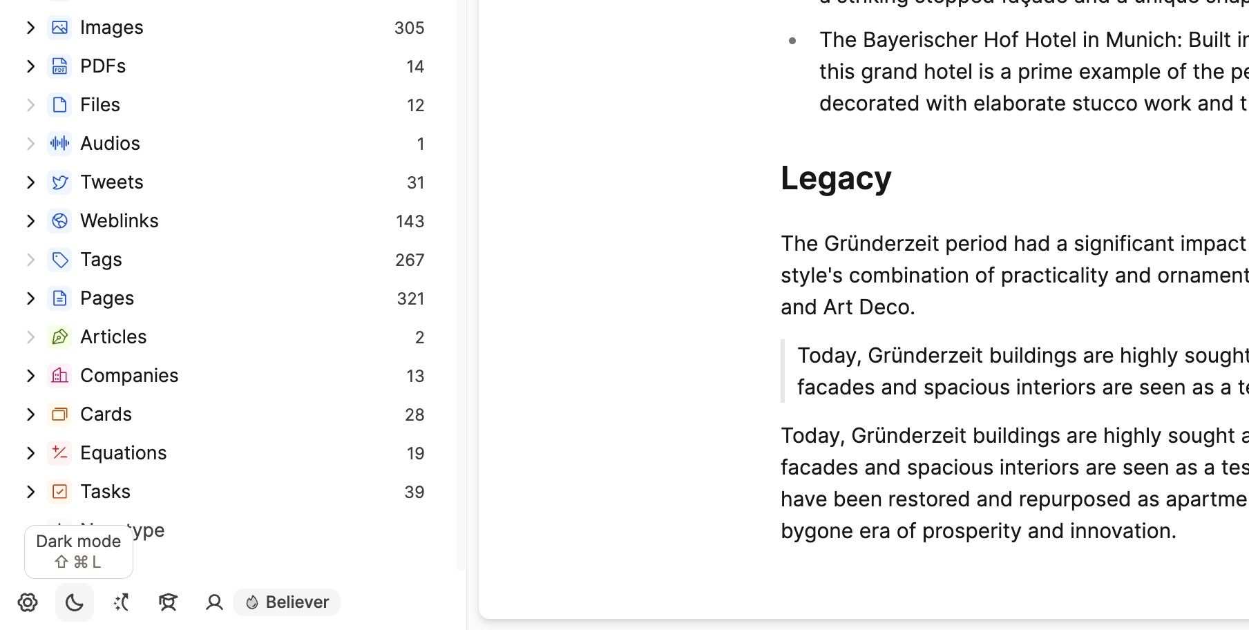
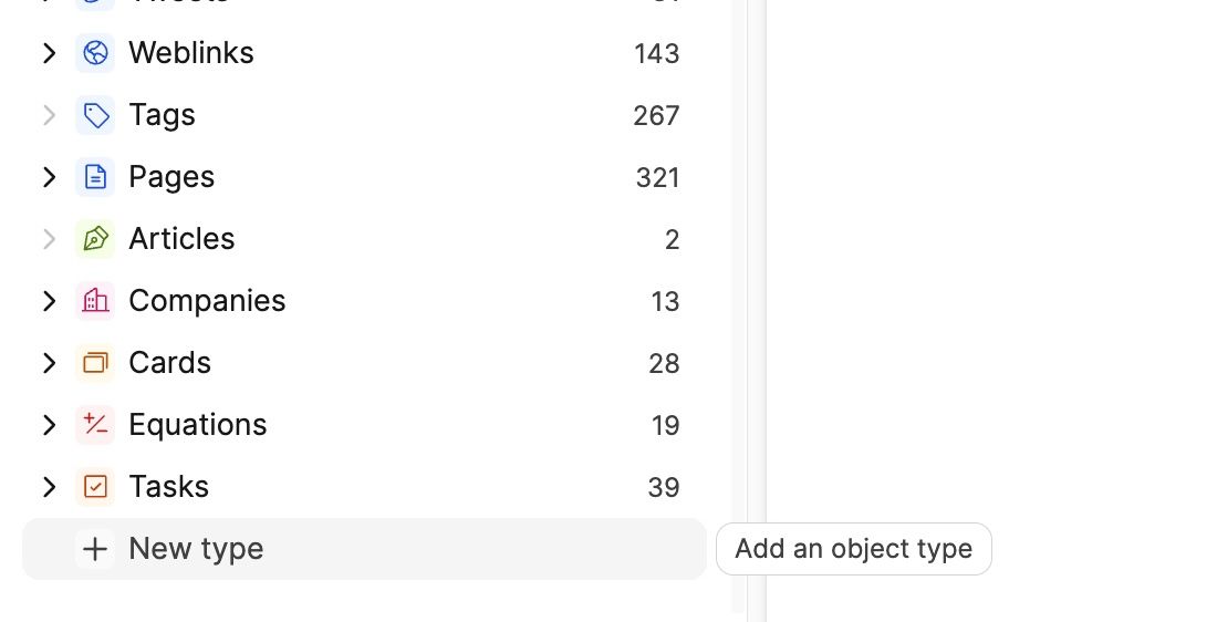
- The button to add a new type has moved: The button to add a new type can now be found right at the bottom of your types list in the left sidebar, making it easier to find and more consistent with the other items in the left sidebar.
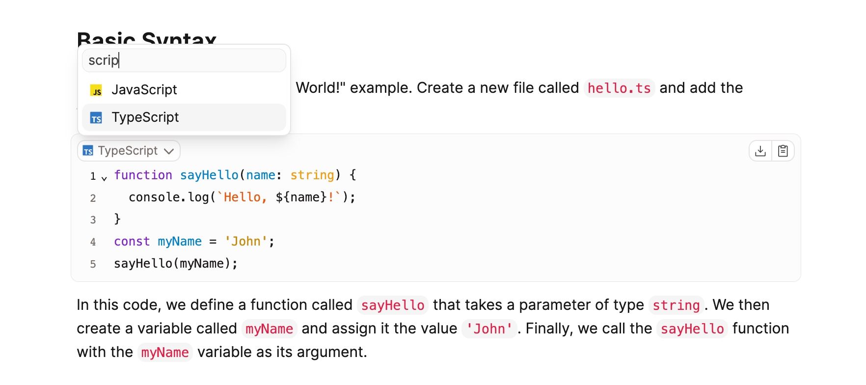
- Filterable select dropdowns: We've added a quick filter to several select dropdowns, such as the language picker for code blocks or options in the sort and filter menus. This makes it easier to find the right option in long lists.
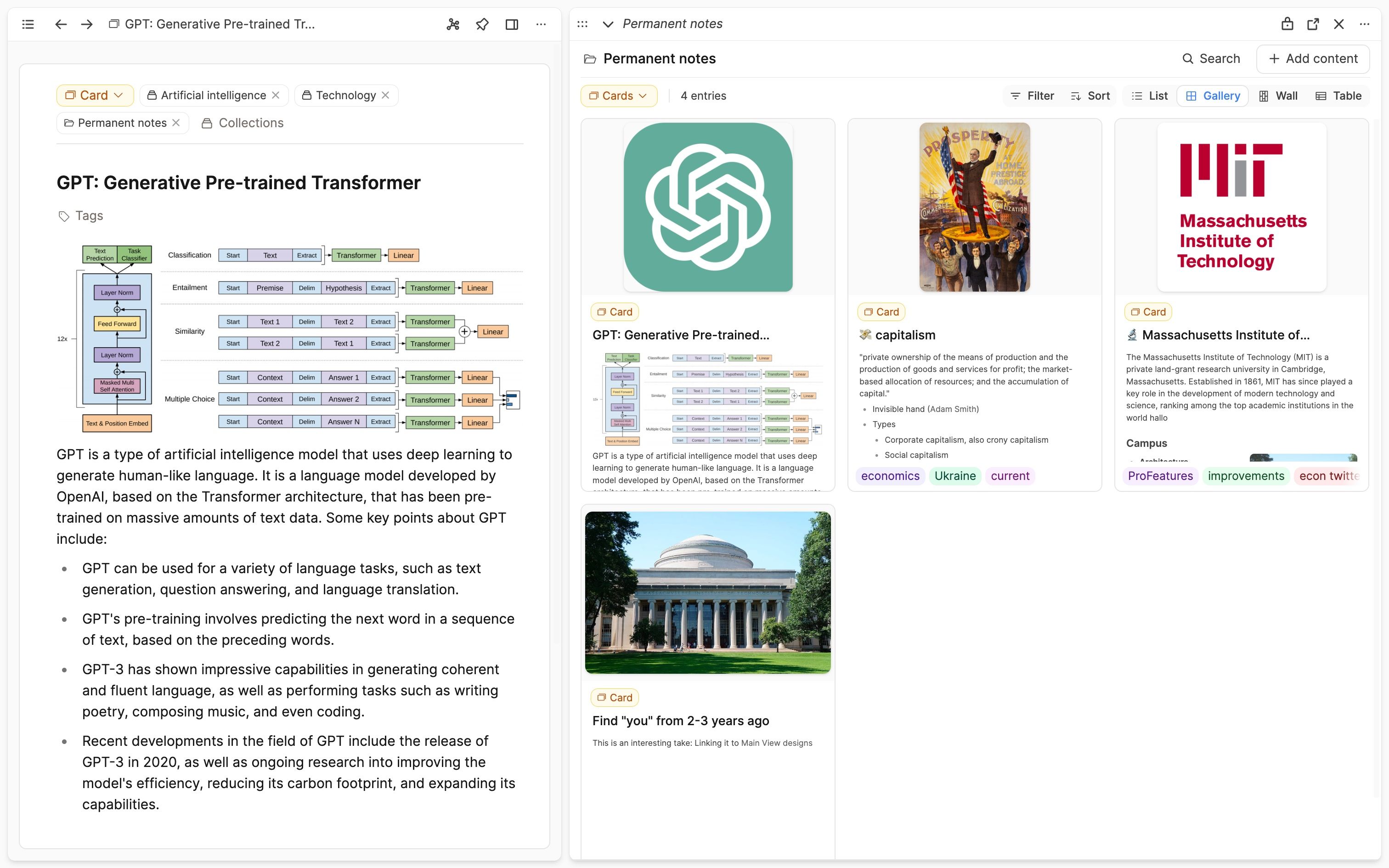
- Resizable areas: All sidebars and side panels are now resizable. Simply drag the border to resize them to the desired width.
- Light mode for code block: The code block now has a dedicated light mode that is easier on the eyes.
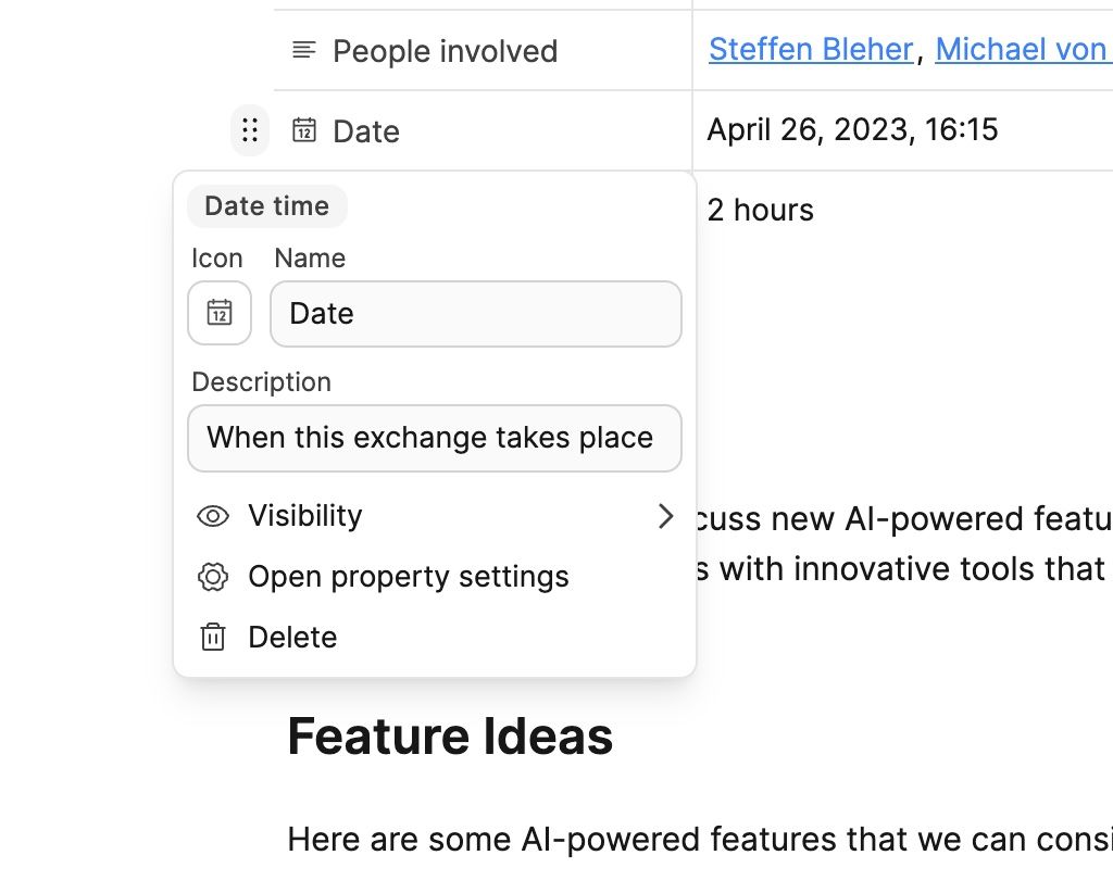
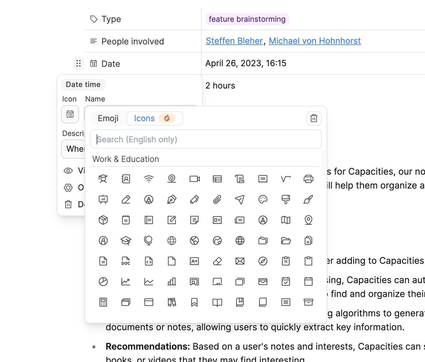
- Property details: We've reactivated icons for properties, so next to the name of a property, you will now see an icon that indicates the property type by default but can be changed to a custom icon (currently believer-only, as all custom icons) or emoji. The optional description you can set for a property will now be consistently shown for empty property values.
- Redesigned date picker: We've completely redesigned our date picker. It's now more ergonomic and easier to use.
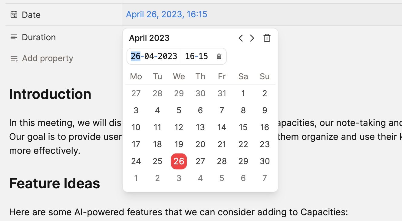
It also fully supports keyboard input, so you can directly type in the date and time. It's also become much smaller and simpler.- Use left and right (left/right) to navigate between the date and time fields.
- Use up and down to increase and decrease the value of the currently selected field. Hold shift to increase/decrease by larger units (correspondingly 7 days, 3 months, 10 years, 3 hours, 5 minutes).
- If you want to add a time just with your keyboard, hit
TABin the year input field to focus the button to add a time. Now hit enter or space to add the time. - Press
ESCorEnterto close the date picker.
Foundation for themes
Those of you who like customization will be happy to hear that this update has laid the foundation for themes in Capacities since every part of the design is systemized. If there is enough interest, we will consider the option to add a variety of beautiful, hand-crafted themes to choose from. A theme can give the UI a completely different vibe and feel.
You can vote on this here.
Full linking support to and from other apps and the file system
We added bidirectional support for deep linking to the desktop app. This means that you can now link from any app to Capacities and from Capacities to any app. The same works for files on your computer.
Linking to content in Capacities: You can copy a deep link to an object in the object menu or by using the shortcut Cmd + Ctrl + L on Mac or Ctrl + Alt + L on Windows. You can also copy a deep link to a specific block by clicking on "Copy block reference" (believers only) in the block menu or by using the same shortcut when a block is selected. You can use these links in other apps to quickly navigate to an object or block in Capacitites.
Linking from Capacities to other apps: You can now paste a deep link from another app into Capacities. It will be formatted as a link and will open the resource in that app.
This also works for files on your computer, email addresses and phone numbers:
- Email address: You can paste an email address formatted like
mailto:[email protected]into Capacities. It will be formatted as a link and will open your email client. You can also use the shortcutCmd + K(Mac) orCtrl + K(Windows) to open the link dialog and paste the email address there. - Phone numbers: You can paste a phone number formatted like
tel:012345into Capacities. It will be formatted as a link and will open your phone app. You can also use the shortcutCmd + K(Mac) orCtrl + K(Windows) to open the link dialog and pastetel:012345there. - Files: You can paste a file path like
file://Users/username/Documents/file.txt(Mac) orfile://C:\Documents\file.txt(Windows) into Capacities. It will be formatted as a link and will open the file in your default app for that file type. You can also use the shortcutCmd + K(Mac) orCtrl + K(Windows) to open the link dialog and paste the file path there.
More object templates
We added three more object templates for you to get started: Zettel, Project, and Organization. You can find them in the object studio.
Block references 1.0 for Believers
We improved block referencing in Capacities and are now launching it as an official feature for all Believers. Block references will later become part of the Capacities Pro plan. You can now:
- Create block references to all types of blocks in Capacities: text, groups, math, code, and more.
- By using the shortcut
Ctrl + Cmd + L(Mac) orCtrl + Alt + L(Windows), you can quickly copy the block reference of the currently selected block.
Reorder collections
It is now finally possible to reorder collections in the left sidebar, just drag and drop them to the desired position.
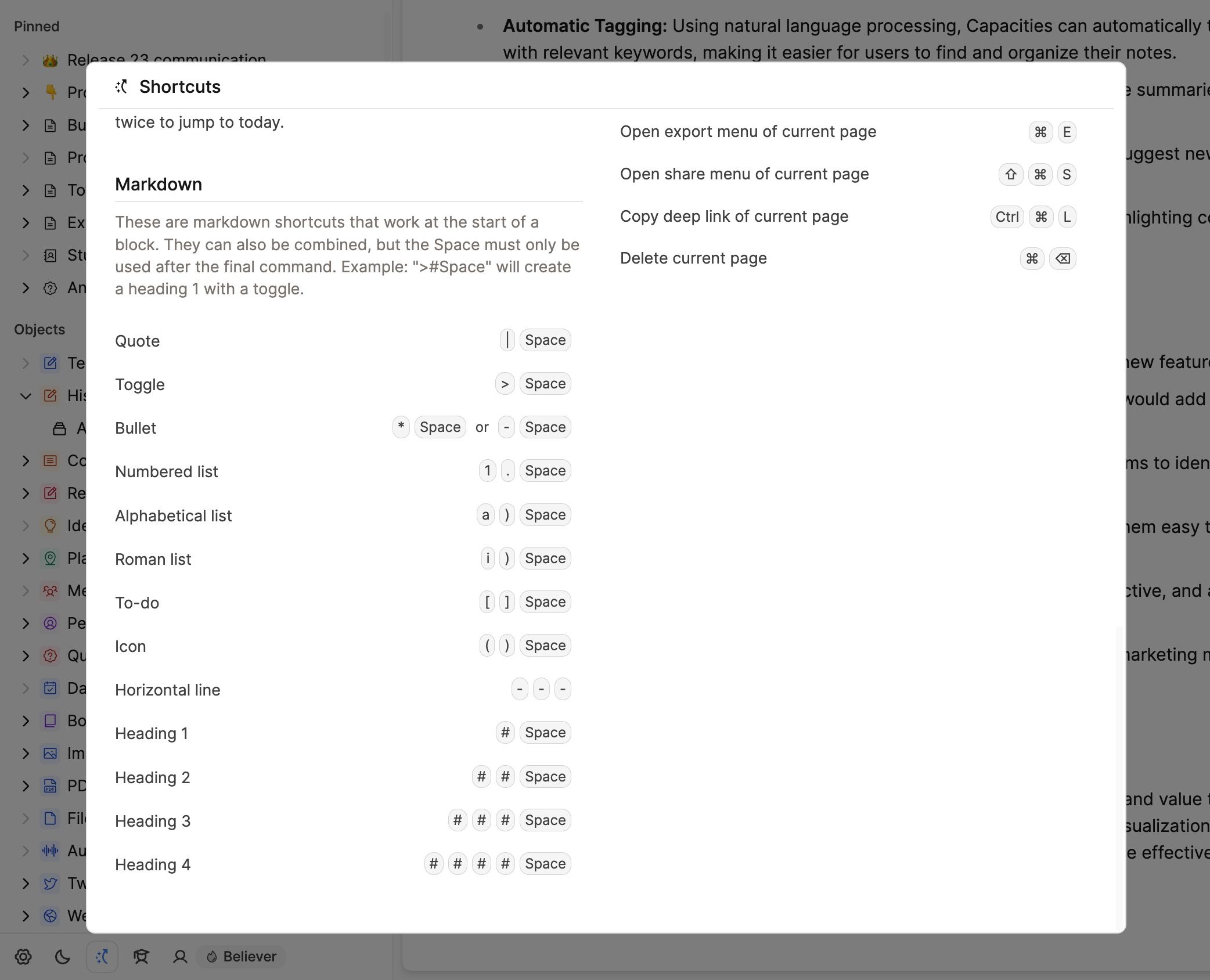
Markdown shortcuts in the cheat sheet
We've added all supported markdown shortcuts to the cheat sheet. You can open it by clicking the shortcut icon at the bottom of the left sidebar.
New onboarding
We've reworked the onboarding to make it more fun, easier to understand and more consistent with the rest of the app.
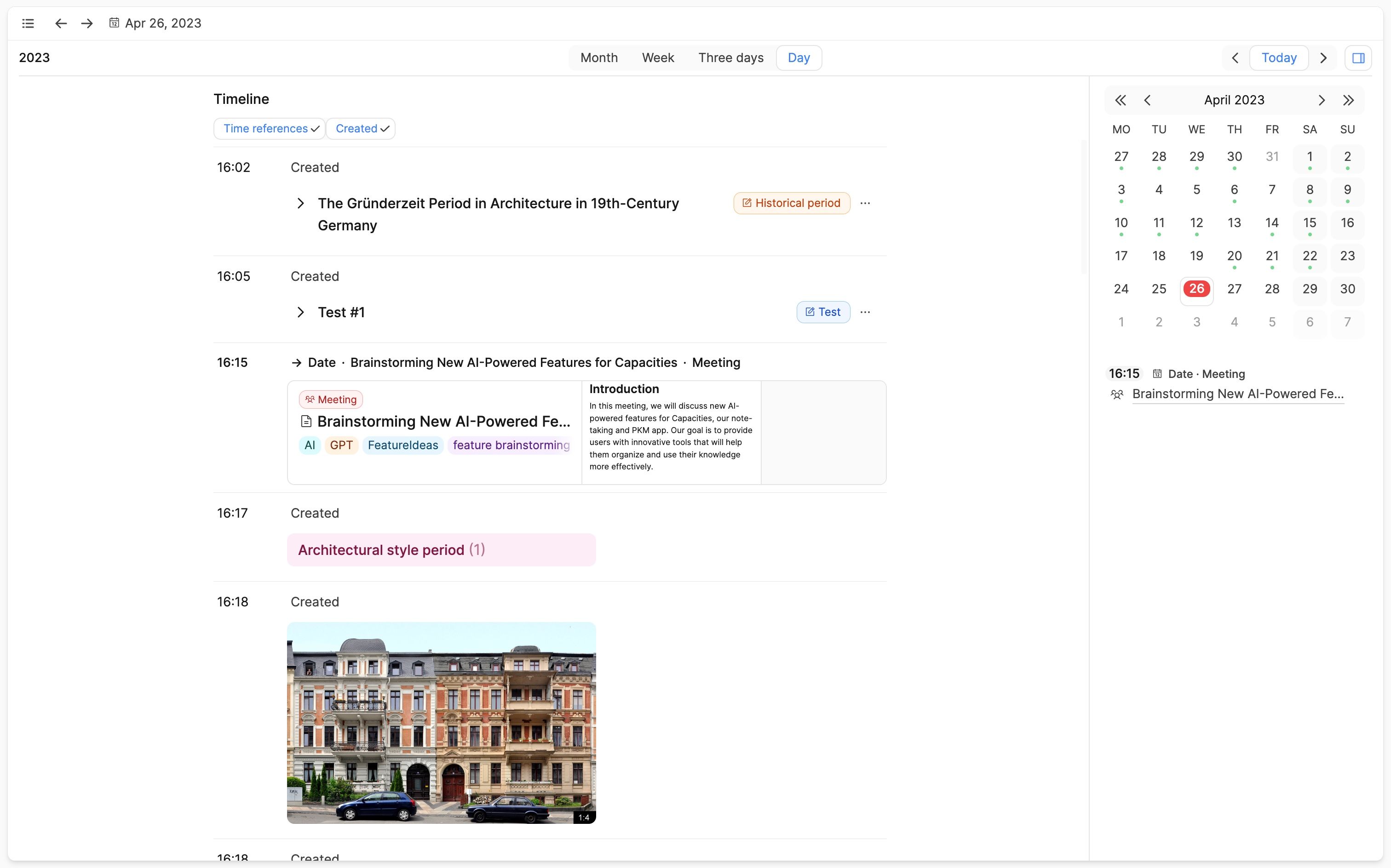
More visual timeline again
There have been requested to make the timeline section (formerly created on this day) more visual again.
Small features and improvements
As mentioned, we've completed over 50 tickets with this release. Some more of the smaller features and improvements include:
- Improved PDF export: We added support for daily notes and improved the overall rendering and layout of the PDF export.
- Select collections for all your templates: You can now assign collections to any of your templates. All content created from that template will be assigned to the selected collections.
- Search support for URLs: You can paste a URL into the
@search in Capacities to check if you already have an object for that URL. We'll integrate this feature into all places where you can create new web links. - Closing tabs via shortcut: You can now close tabs via the
Cmd+W(Mac) orCtrl+W(Windows) shortcut. - You can now navigate between pages using
Cmd + [andCmd + ](Mac) orCtrl + [andCtrl + ](Windows). - Support for text editing shortcuts on Mac: We improved the support for shortcuts like ^A, ^E, ^N, ^D, ^F, ^B, ^P.
