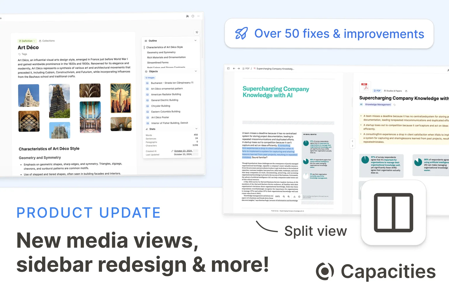
It's been a while since our last update. With this release, we're bringing you countless improvements across the board! Read on to see what's new.
Improved Media Views
Media is a crucial part of Capacities; images, weblinks, and PDFs are not just simple additions to your notes, they're objects of their own.
Revamping our whole media experience and expanding what's possible with media is part of our current roadmap, as written in our "What's next" article.
With this release, we are laying the core-concepts for further developments by unifying and improving the page views of all media types.
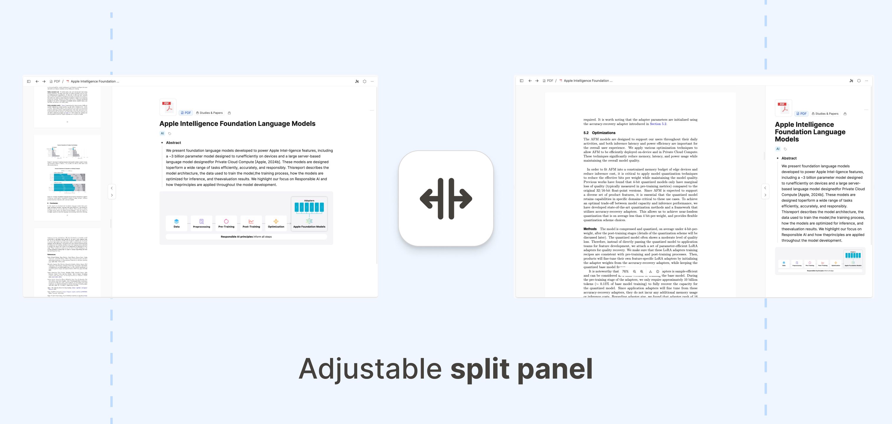
Today, there's a new split-screen experience that makes taking notes on your media easier than ever. This gives you full control over working with media:
- Toggle the sections you want to see: Whether you want to focus on the media content only, focus on your written notes, or see both at the same time – you now have full control.
- Shortcuts: We've also added shortcuts to quickly toggle the visibility of the sections:
- Use ⇧ ⌥ → (Mac) or Ctrl Alt → (Windows) to show/hide the notes section
- and ⇧ ⌥ ← (Mac) or Ctrl Alt ← (Windows) to show/hide the media section.
- Shortcuts: We've also added shortcuts to quickly toggle the visibility of the sections:
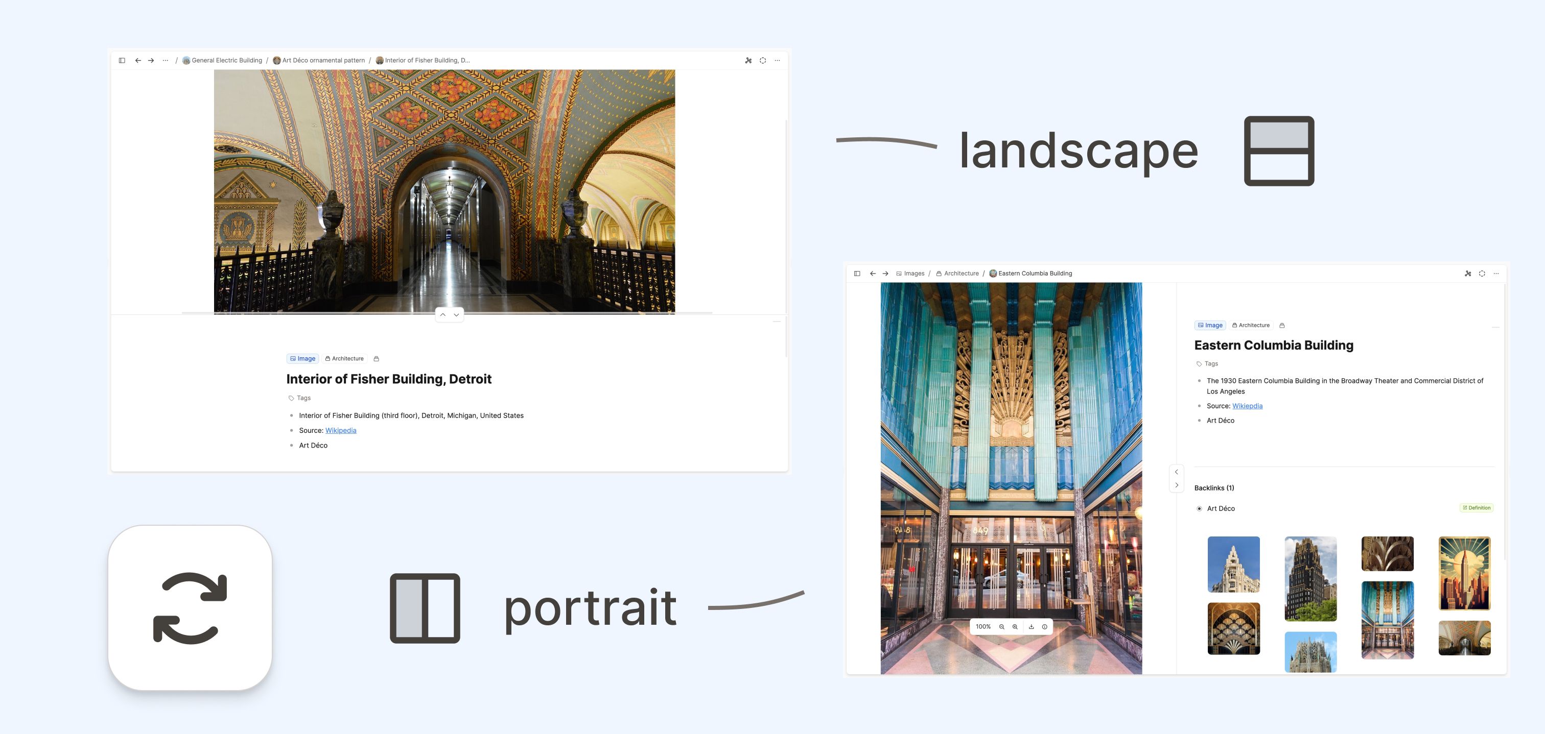
- Choose landscape or portrait mode: You can also set whether you want to split the page vertically or horizontally.
- Resize the sections: You can resize the split panel to your liking.

Much more Flexibility & new Possibilities
Our new split panel opens up so many possibilities when taking notes on media with Capacities. Here are some examples:
- Taking notes on YouTube videos side-by-side:

- Using the split panel to read PDFs and take notes at the same time:
In addition, we have also added several improvements to our media types. This includes:
- Redesigned audio player on mobile devices.
- Redesigned page and card views of weblinks.
Under the hood, caching and offline mode for working with media files on all our mobile devices has been added as well.
Improved Sidebar Design
We've given the right sidebar a makeover across all object types – there's now a unified experience with much smoother and faster interactions.
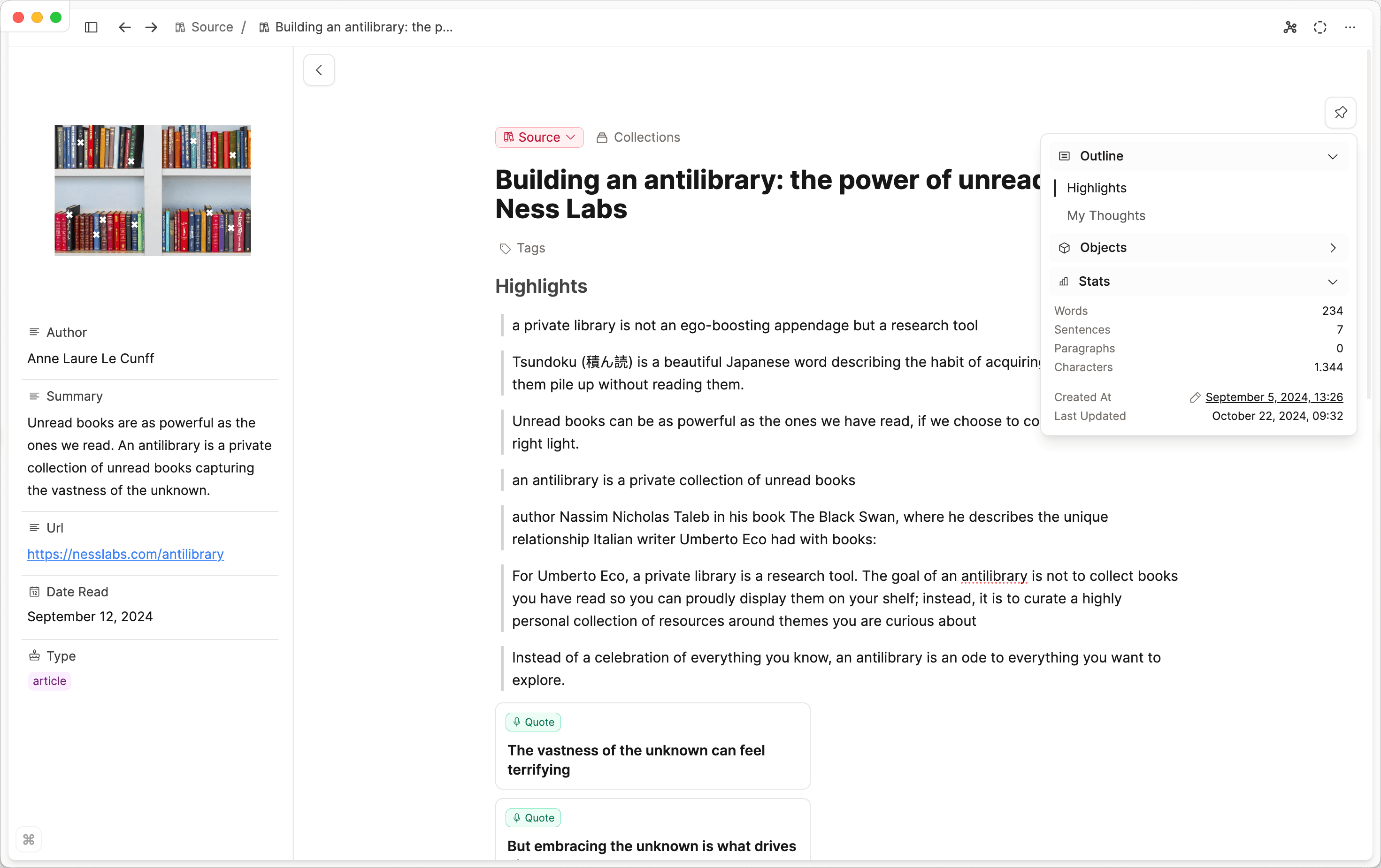
The new design floats on top of your work, which is great for easy access to your table of contents or to see the word count. You can hover over the lines on the right to open it or pin it so it's always open.
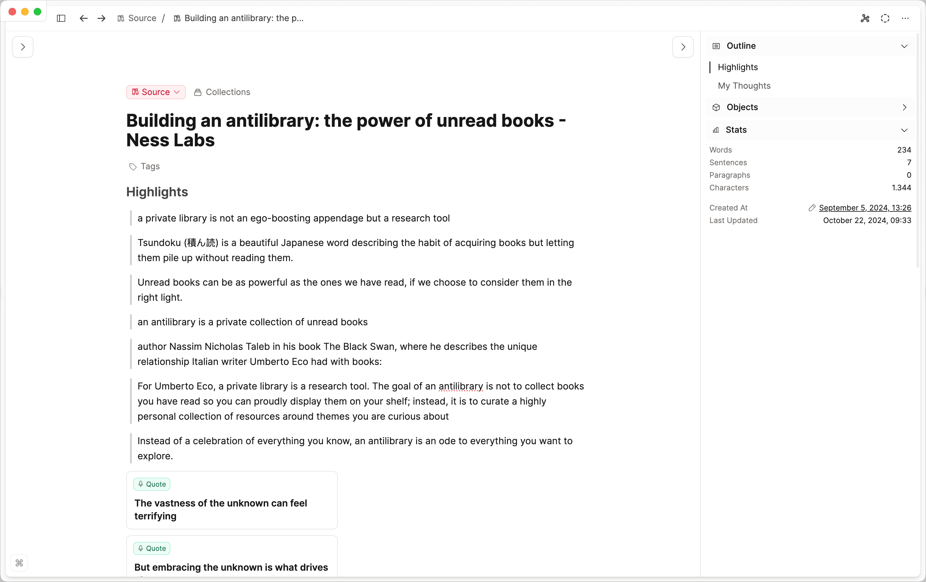
If you'd prefer the static sidebar like the previous version, you can choose that too. Set this as the default option in the settings: go to Settings > Editor > Default Page Sidebar Position.
This sidebar redesign also gives you access to sidebar info when there is little space. In these situations, it automatically switches to the floating design. That way, even objects that are opened in the side panel will have the sidebar info accessible to you:

Critical Performance Issues
We were able to track down and fix two critical performance issues that led to lagging and freezing for some users.
The first one occurred in content with many links. Users experienced long delays when selecting blocks or performing normal operations. This is now gone.
The second one was happening when editing text in the backlink section. It led to long delays when typing. We were also able to fix this.
Faster, Snappier, and More Beautiful
We've made countless improvements to the overall feel of the app, so everything should load faster, look better, and be more enjoyable to use. Some of the highlights:
- Cleaner AI chat design
- Tag pages and backlink sections load faster
- Better graph view performance
- Slightly updated calendar design
We've listed all the other updates we made at the end of this page.
A big step towards fewer bugs and issues
We introduced new processes to make sure we can catch and fix bugs and issues faster. With this release, we're shipping more than 130 bug fixes and improvements (see below)! From now on, you can expect more frequent fixes and a faster pace of issue resolution.
Deprecation notice
With the next release, the partial sharing of collections will be deprecated. This is a very old feature that we never promoted and only a few people used.
With the next update, collections will have a similar sharing experience to tags: If you share a collection, all items in that collection that are shared will be visible in that collection.
If you used the partial sharing feature, make sure to unshare objects you don't want to be visible in a shared collection. You can simply remove shared objects from shared collections if you don't want them to be visible.
News & Content since the last Update
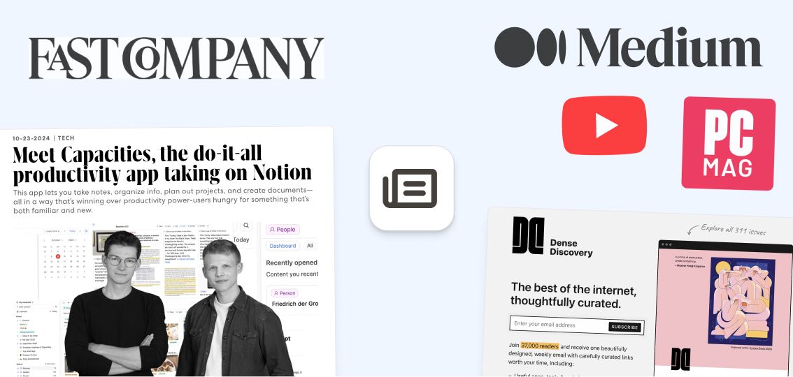
Here are some of the highlights of new content and coverage around Capacities.
From Us
- Customizing Your Object Types
- What's NOT next?
- Community AMA from our offsite is coming soon!
In the Press
- We got an in-depth feature in this Fast Company Article
- PC Mag gave Capacities a shot and left their review here: PC Mag Review
- Recommended in Dense Discovery Issue 311 – a Newsletter with 37,000 subscribers for "curated links worth your time" that are "spanning a variety of topics – from tech to design and sustainability to urbanism".
From the Community
- Antone's review of the new Tablet App
- Renée is using Capacities for some 100 Days of Note-taking Notes
- Capacities vs Obsidian comparison by Antone
- Tara's post about a quick & easy Level 10 Life setup in Capacities
More changes and improvements
We told you that this release is packed with improvements and fixes. Here is everything else that did not make it to the top section:
- Toggle the visibility of objects opened in the side panel: Many users love the ability to open objects on the side (using shift-click). But sometimes, you want to focus on the main object again without having to close it, thus losing the context of the object in the side panel. There is now a little arrow/caret on the right side of your screen that lets you toggle the visibility of the side panel objects:


- Option to select page on app start (per device): You can now select between the last opened page, the calendar, or today's day in the calendar as a start page when the app launches. You can change this option in Settings > Editor settings. Ticket
- Option to unpin collections from the left sidebar: If you have many collections, you sometimes want to hide some of them in the space overview. You can now unpin collections from the left sidebar by clicking on the little pin icon in the top right of a collection page. These collections are still visible in your object dashboard. Ticket.
- X-Callback-URLs on mobile devices: You can now also call Capacities from other apps using X-Callback-URLs. More information here.
Improvements
- Backups & Markdown Exports: Now using relative paths for compatibility with more apps. Link to ticket
- Unified Date Node: Daily notes and date links are now combined into a single node in the graph view.
- Media Uploads: Easily upload multiple media files on mobile.
- Media Type Handling: Improved layout for embedded media types like audio, files, and web links.
- Focus Mode: Moved the button to the top right and shortcuts are hidden in focus mode.
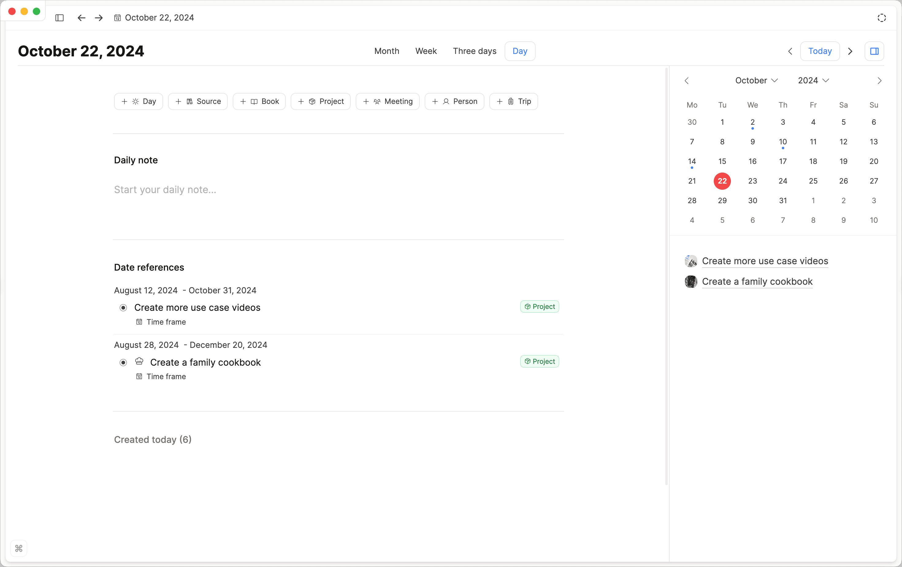
- Calendar Sidebar: Adjusted day view for better space management.
- Syntax Highlighting: Now supports Elixir and GraphQL in code blocks.
- Table Cell Content: Content wraps in table cells.
- Shortcuts: Streamlined exit from code and math blocks.
- Resize Handlers: Redesigned for the property sidebar.
- Mobile Tooltips: Added support for tooltips on mobile devices.
- AI Context Selection: Use block selection in notes for contextual AI assistance.
- Disable Swipe Navigation: Ability to disable swipe navigation in the editor.
- Date Formatting: 'Automatic' option for the date formatting order (e.g. dd/mm/yy), based on the language setting.
Bug Fixes
- Checkbox Visibility: Improved in PDF exports. Link to ticket
- Smart Command Syntax: Fixed issues with commands after pressing enter. Link to ticket
- Focus Mode Padding: Improved on Mac when not in full screen. Link to ticket
- Wikilink Exports: Functionality improved across all title cases. Link to ticket
- Today’s date for is iPad wrong. Link to Ticket
- Not all properties showing in object. Link to Ticket
- Raycast (sync) broken. Link to Ticket
- Page not opening after opening in another tab from search. Link to Ticket
- Query definition inconsistency. Link to Ticket
- Share function in iOS doesn’t work - should it?. Link to Ticket
- Deeplink not working on iOS. Link to Ticket
- Cannot combine todo ( ) with tag ( # ) in Telegram. Link to Ticket
- Next/prev 3-days/week/month always switch to day view. Link to Ticket
- Query not showing results. Link to Ticket
- Better Device Detection: Better tablet and mobile phone detection (some Android phones were detected as tablets).
- Rendering Issues: Fixed for images and media loading on mobile.
- AI Instruction Deletion: Prevented if the text area is empty.
- Navigation Bar: Improved display in content picker.
- Page Sidebar Layout: Fixed index card layout problems.
- Multiple Block Selection: Enabled shortcuts for non-MacOS devices.
- AI Chat Scrolling: Now works smoothly in side panel (web app).
- AI Autofill in Tables: Improved for editing collections.
- List View Borders: Always visible in list view.
- Query Editor Modal: Fixed display issues when creating new queries.
- Math Block Shortcuts: Resolved toggle bug in column layouts.
- Undo/Redo states: Added support for checkbox property.
- Number Property Display: Improved in table cells with progress bars.
- Side Panel Visibility: Ensured it's not hidden when accessed in focus mode.
- Content Glitches: Fixed random issues when opening new tabs.
- Freezing Bug: Resolved when opening block menu.
- File Downloads: Supported for all file types.
- Rendering Issues: Fixed various object property displays.
- Number Property Persistence: Improved with decimal settings.
- Inline-Link Editing: Enhanced user experience.
- PDF Image Export: Resolved broken image issues.
- Audio Playback: Support playback of WAV audio files.
- Date Picker: Respect date formatting order setting (e.g. dd-mm-yy).
