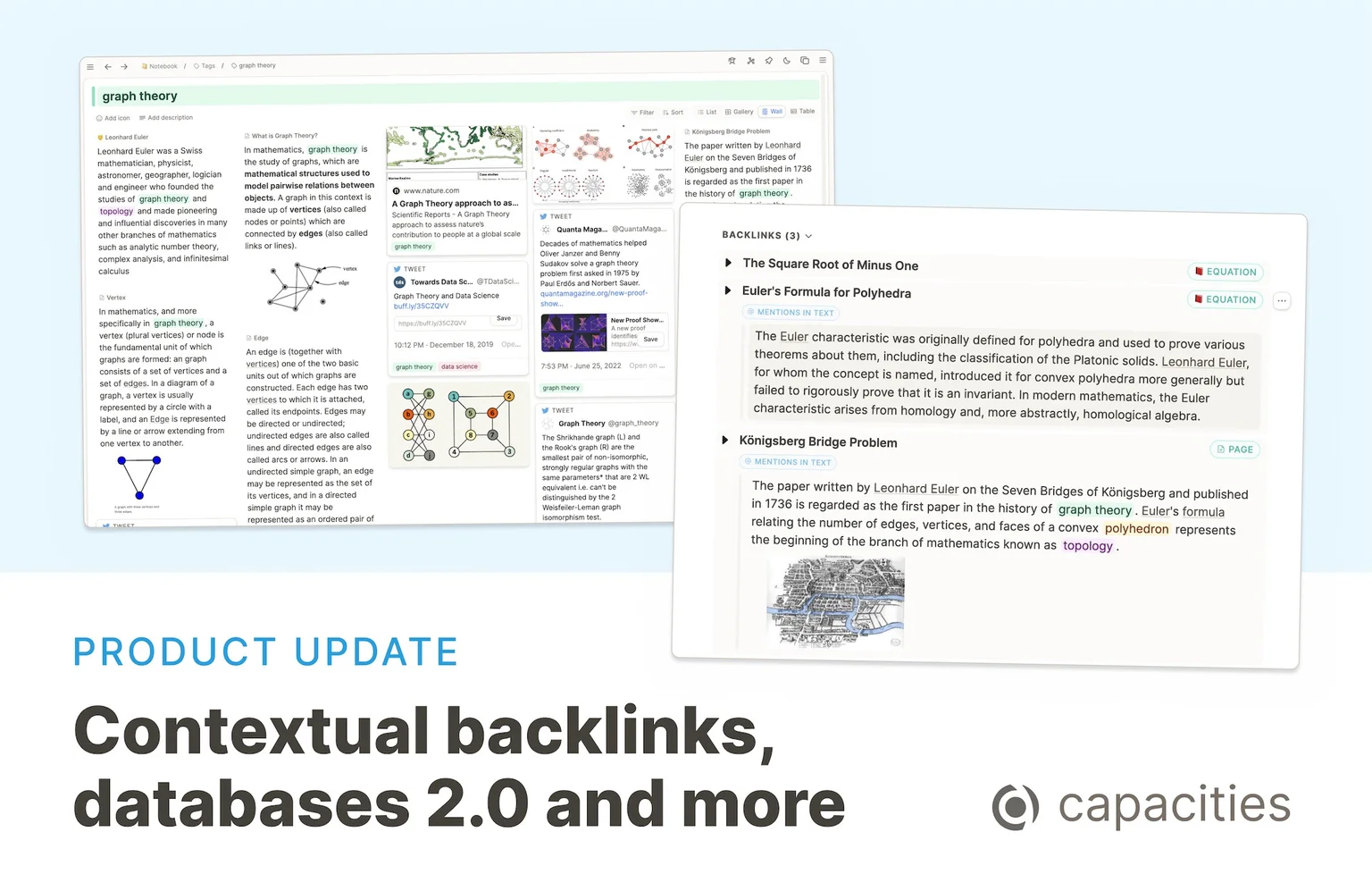
Contextual backlinks
If we reference content somewhere we are often interested in the full context of that link: In which sentence or paragraph is it used? Was it referenced in a nested list where the parent could give additional info? Does the block with the link have children that provide even more details? If you are not familiar with the concept of (contextual) backlinks, we recommend reading Andy Matuschak's notes.
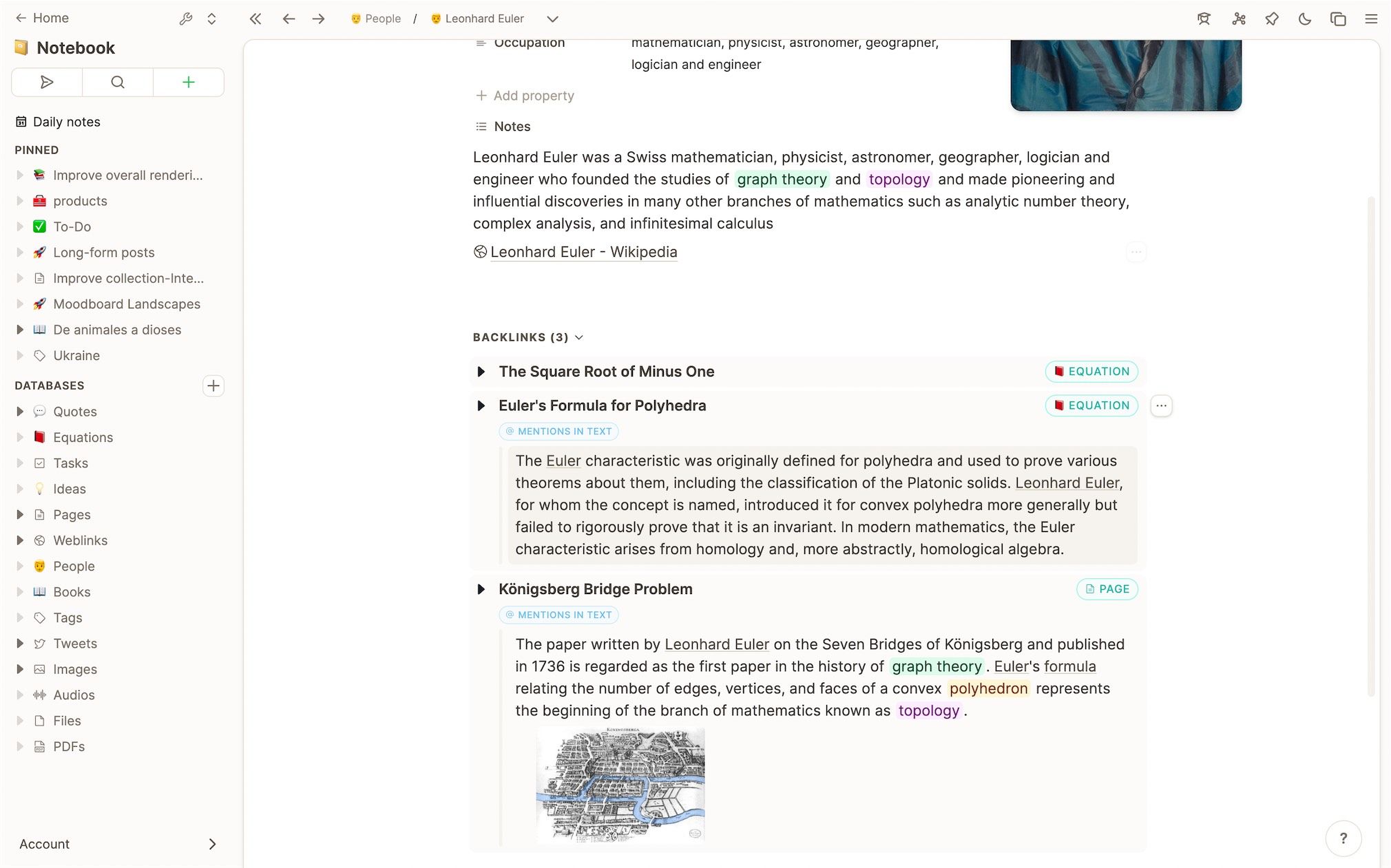
Enabling this is a game-changer many of our users have asked for. Capacities now shows contextual backlinks with the individual blocks where the link or tag has been made. This includes the path of parent blocks this block might have as well as its children. It works for inline links as well as tags being used in the text.
There are two different situations where contextual backlinks are displayed:
- Backlink section for each content: If a content is referenced somewhere you will find a section labeled "Backlinks" at the bottom. The context of that link is displayed here, labeled with "Mentions in text".
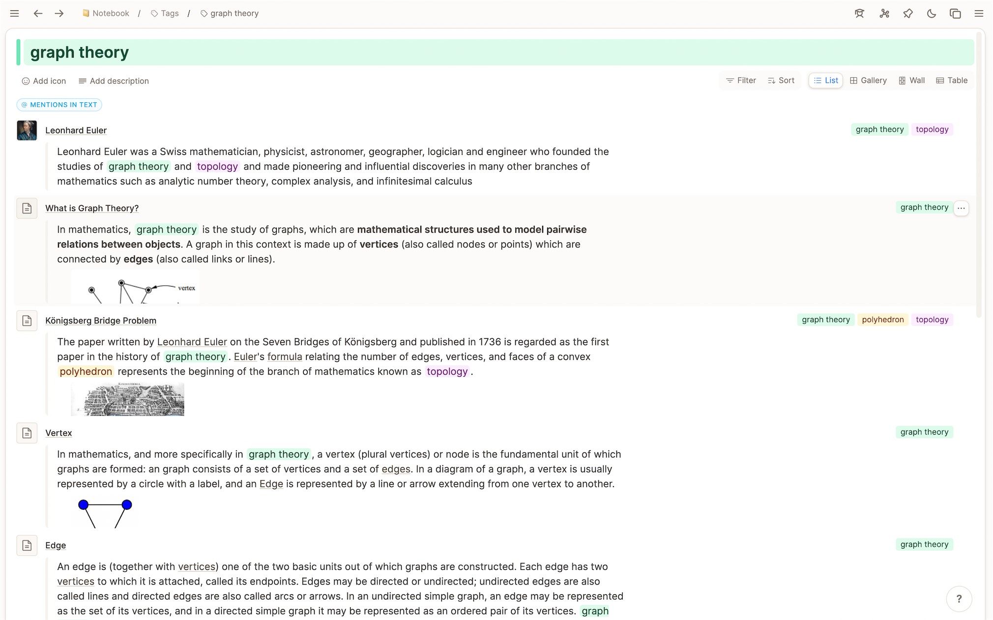
- Wall, list, and grid view of tags: On the page of a tag we show contextual backlinks in a dedicated section named "Mentions in text" at the top.
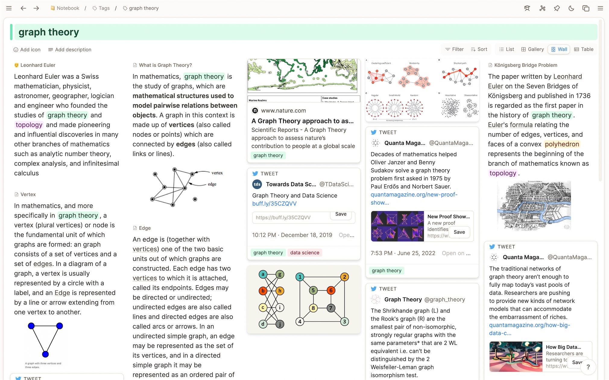
In the wall view, text references are shown as text snippets directly on the wall. By using this you can create a wall of text content combined with cards if you use the tag field at the top of an object.
We are excited about how this will change your experience with Capacities, it already changed ours. One use case users have been mentioning in their feedback is to quickly tag individual text blocks or to-dos on the fly and then process them further the next time they review the tag page.
Databases 2.0
Capacities real power comes with its custom object types because they enable you to define the structure of your notes. Create meetings, books, or questions instead of monotonous pages.
Our focus so far has been on the basic types such as pages, images, or web links to build a solid foundation of the most common types of content and media. We will continue to work hard on the basic types and expand the repertoire with more types such as quotes or code snippets which will then also get their own database and additional properties to tag and organize them on a top-level.
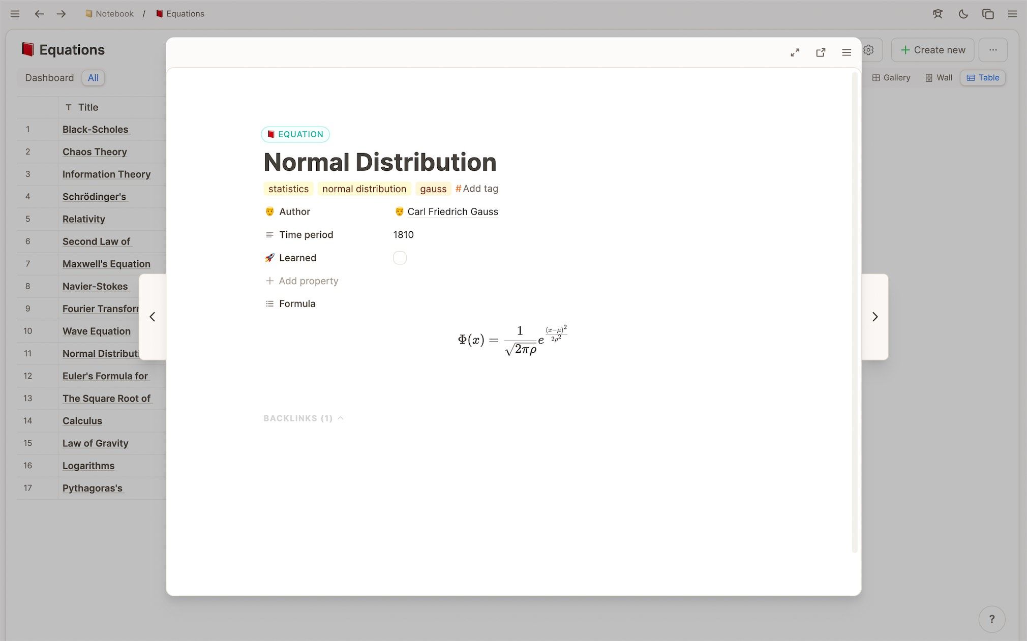
With this release, we are starting to extend the power of custom types with a complete redesign of tables and object pages, local filter sets to build dashboards, and improved usability.
Redesign of custom objects
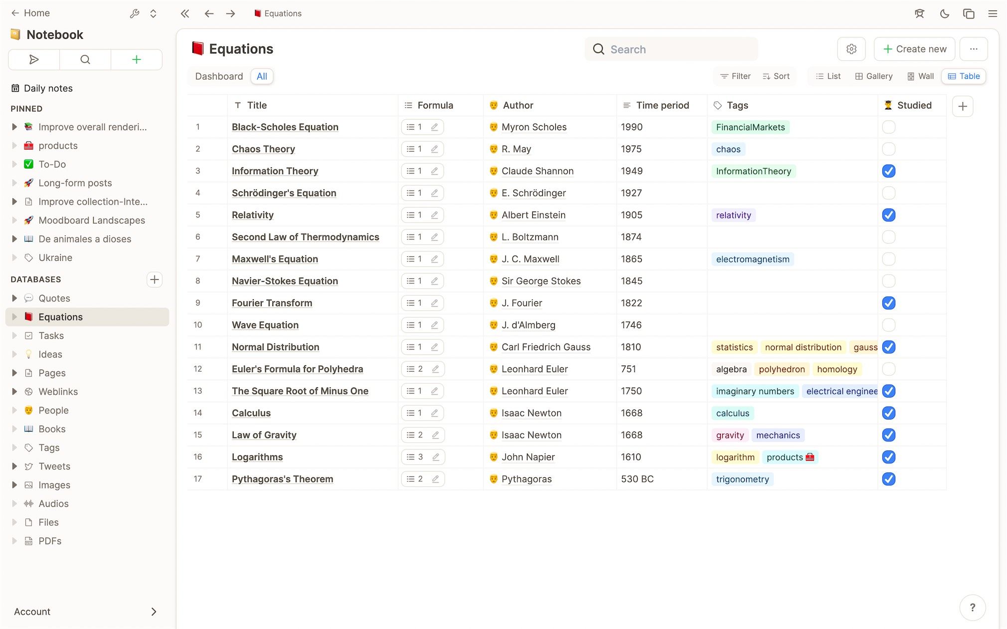
We started with the table layout and redesigned the cell for each property type to achieve a more unified look. We also improved the experience of editing properties in the table by improving input and picker elements. For now, a table cell only displays one line of text/content. In the future, we will add additional settings to customize this for each property.
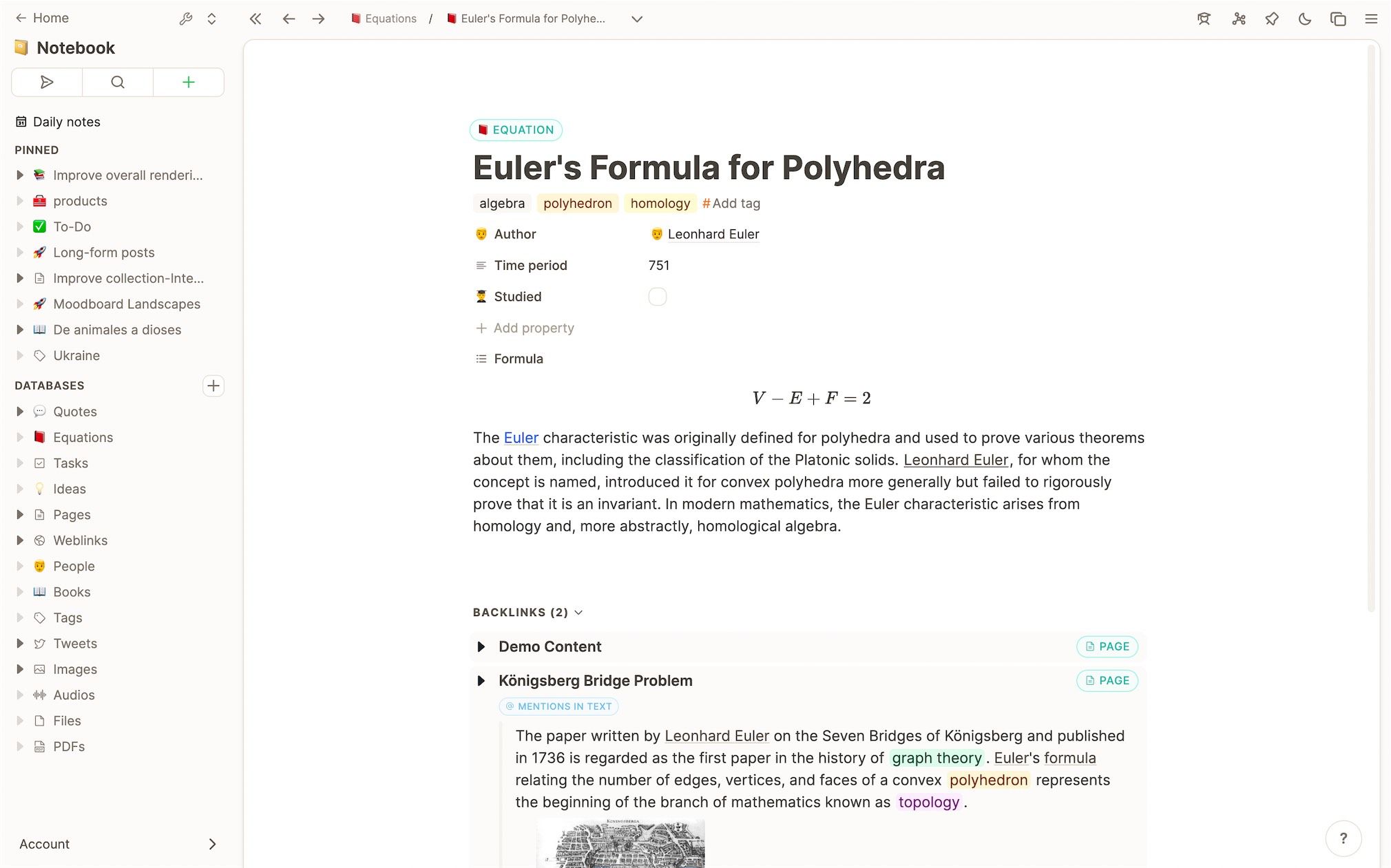
In the next step, we did the same for the list of properties that is shown on the page/embed views of custom types. They are now visually more aligned and more pleasant to work with. From here new properties can be added and the order of properties can be changed by dragging them around. Blocks properties are always positioned at the bottom, but if you have several "blocks" properties, you can rearrange them, too. The handle for properties gets the same look as the handle for blocks. For each property, there is a dropdown menu to edit the name and icon or to delete it.
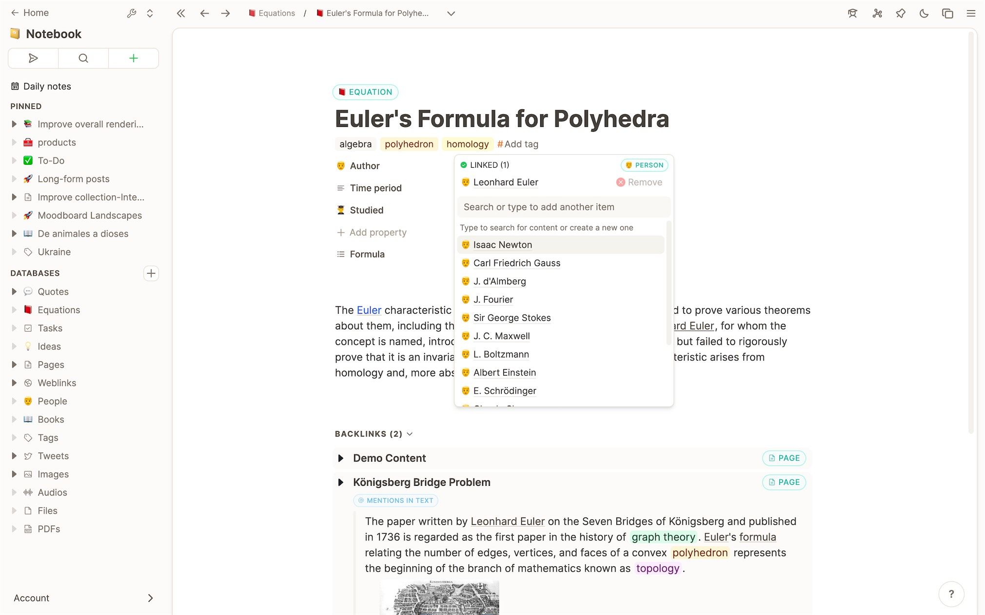
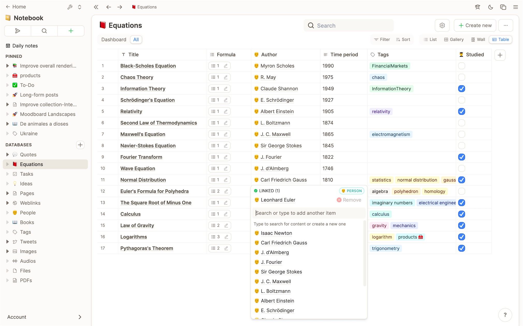
Working with custom types and databases is simpler and more powerful: For properties that link to other object types, we've added a dropdown picker similar to the dropdown for tags with less friction than a large modal. The large modal is still used for media where a bigger preview of content is helpful.
Local filters to build dashboards and workflows around object types
If you embed tags or collections on a page the filters, sorts, and view will now be local. By embedding tags and collections you can now build powerful dashboards with Capacities: You can for example embed a collection on a page twice and filter for the tag "todo" in the first and for the tag "doing" in the second.
If you add a new entry to a collection or your database it will (as best as possible) be compliant with the active filters. In the example from above, a new object would automatically be tagged with "todo" or "doing".
Sharing made easier and more transparent
Sharing content in a knowledge graph enables you to create digital experiences for others that can be explored. This is different from what we are used to: Books, Documents are linear concepts that you scroll through while a graph can be clicked through, allowing you to connect and visualize related concepts right where you need them. We took this a step further and made it more intuitive.
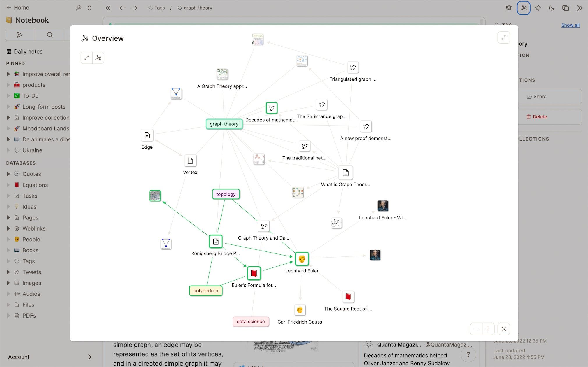
In the graph view of a content you now see which parts of your knowledge graph are public and which are private. Links that can be explored by users who have access to your content are also highlighted in green.
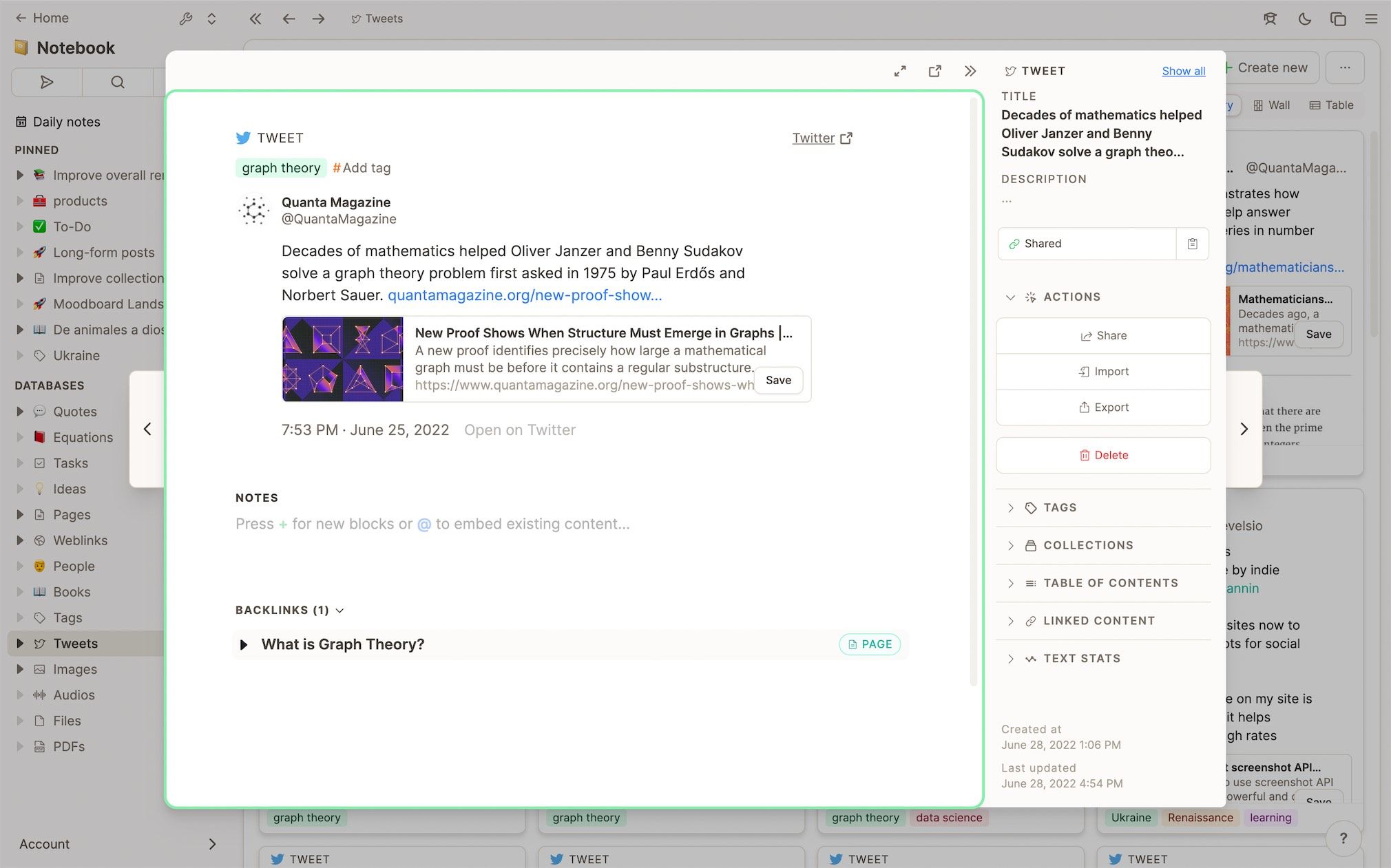
When you open a shared content as an author you are entering a different context: You edit the content that is visible to others. To make this clearer all public content has a green frame making it simpler for you to switch contexts.
On top, we made the sharing process more intuitive. By default, daily notes will not be shared anymore unless you share them explicitly. If you remove read permissions of all included content will be removed as well by default. For content that is shared in another context, you will see an indicator and you can decide if you want to remove permissions here as well. We published a tutorial on how sharing works in Capacities here.
Miscellaneous
- Automated tag inheritance for media: If you add images, PDFs, ... to a page the media object will inherit the tags of that page. We might add a setting to make it possible to disable this behavior, but we think that most of the time it is very useful if media receives the same tags as the content in which it was created. (June 13, 2022)
- New block handle: We wanted to remove the number of elements that pop up when hovering over a block in the editor to reduce overall distraction and 'noise' in the UI. We replaced the nine-dots-icon on the left with a more subtle circle. We also moved the "plus" buttons that used to appear on the top right and bottom left of a block to the left. They only appear when hovering over the circular handle on the left. (June 20, 2022)
- Text statistics also for selected blocks: When a range of text is selected, we show a small indicator for the text stats of that selection. The same now also works for a selection of blocks. This can be super useful to check how many words or characters a couple of paragraphs have combined. (June 20, 2022)
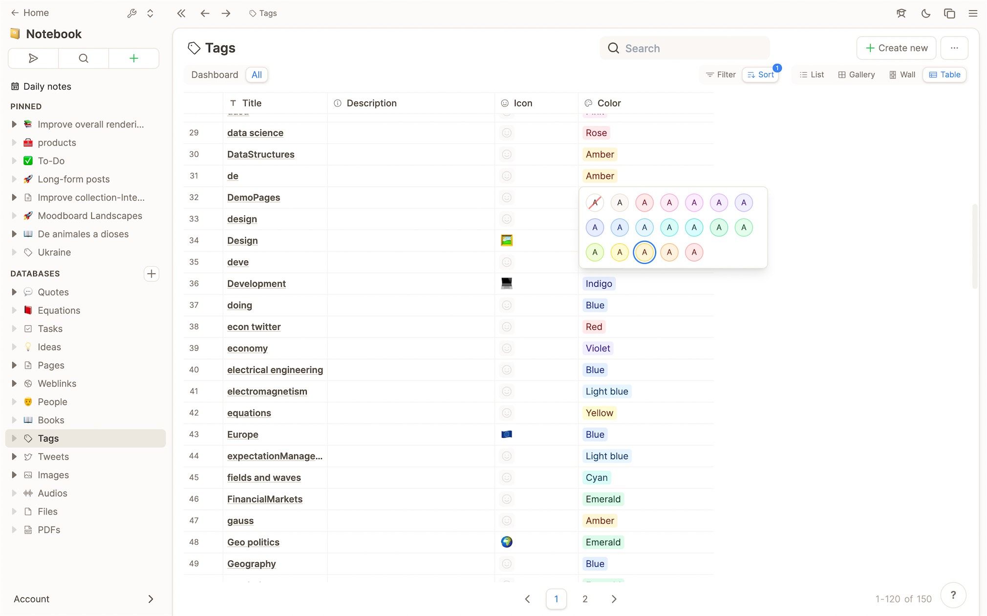
- Color picker for tags in table view: We have added a nice little color picker to the color property of a tag in the table view. You can now change the color quickly when reviewing your tags in the table view. The selected color is also visualized as a colored label.
- Accessibility of column resize handle: The resize handle for table columns in custom databases for the last column was not accessible. This has now been fixed.
- Tag dropdown: We fixed a reactivity issue and improved some details in the design (e. g. position of loading spinner).
- Show more entries of tags in the database We now show more entries in the database dashboard for tags (120 instead of 40), because tag preview cards are small and it's important to view as many tags as possible on one screen.
- Better UX of adding HorizontalLineBlock via dropdown: Automatically insert and focus empty text block after HorizontalLineBlock when added via dropdown. Hint: Typing
---at the start of a line also generates a HorizontalLineBlock. (June 20, 2022) - Home shortcut: Press Cmd/Ctrl+H to go back to your daily note dashboard. (June 20, 2022)
Improvements
- Better change stack with undo and redo: In normal text fields, we now support a local change stack where you can undo and redo changes if you focus the text field. (June 20, 2022)
- Improved delete logic: Delete can now happen in the background. You don't need to wait until all content is loaded to confirm a delete operation. (June 14, 2022)
- Improved: Better image rendering performance. (June 6, 2022)
- Improved: Better design for arrow buttons in preview modal.
- Improved: Better design of tabs.
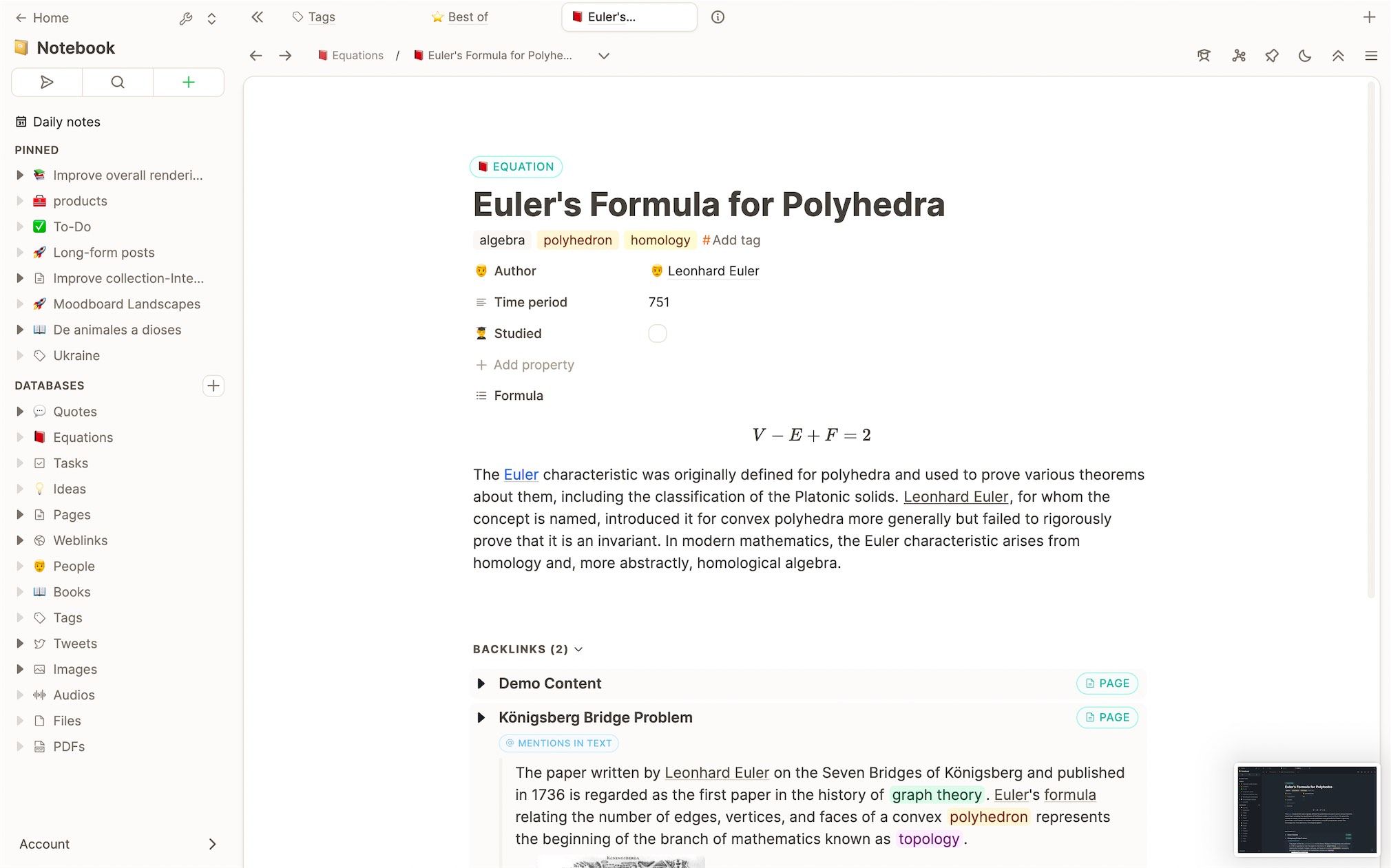
- Improved: Explanation of how tabs can be persisted in Capacities.
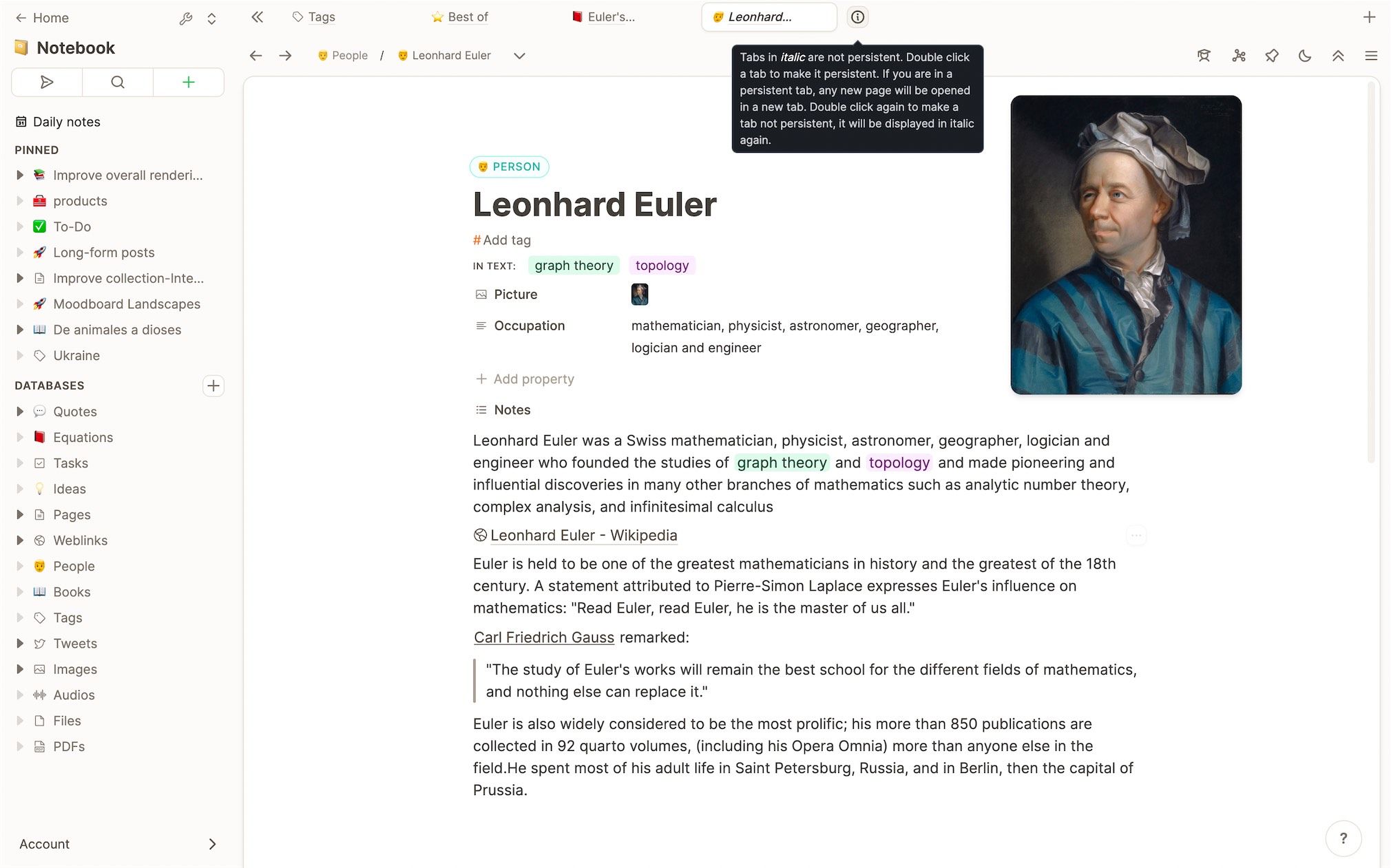
- Improved: Better design of active states throughout the app.
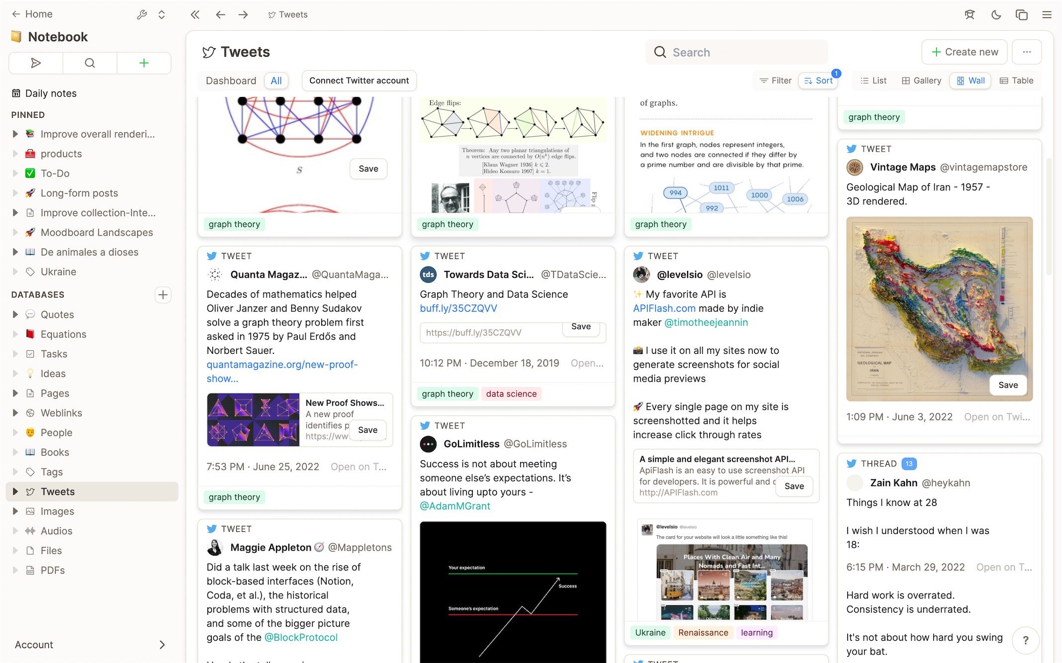
- Improved: Some design details in the small card of a tweet such as image and content width have been improved.
- Improved: The breadcrumbs above the content panel have a more aligned design.
- Improved: Consistency improvements of all card designs.
- Improved: We improved several layout details in the small preview of "blocks" content.
Changes
- Removed: Deactivated navigate to space shortcuts (via space number). (June 20, 2022)
- Facebook Messenger integration deactivated: Meta, unfortunately, does not allow to fully use of the API. For now, we need to deactivate the Facebook Messenger integration. Might be activated again. (June 14, 2022)
Bug fixes
- Fixed: Pressing
delat the start of a text block removes character and only unbreaks/removes block when the block is empty. (June 20, 2022) - Fixed: Better handling of escape when the preview modal is open. (June 20, 2022)
- Fixed: Backspace and Delete behavior. (June 20, 2022)
- Fixed: List view now opens the preview of object when clicked in ObjectMenu. (June 20, 2022)
- Fixed: Some remaining issues with image rendering (flickering, layout shifts).
- Fixed: Deleting the custom emoji of a property sets the icon back to the default icon for that property type.
- Fixed: Prevent default behavior of ctrl + h or cmd + h (it opens chrome history for some users).
- Fixed: We fixed many issues with the mobile version of the responsive design (menu blocking the screen, overflowing content, etc.).
- Fixed: There was a reactivity issue in some cases when adding/removing tags to/from content.
- Fixed: There was a bug in the block selection and in text stats.
- Fixed: Blur any selections made in document when opening the feedback form. (June 20, 2022)
