Our first redesign
User interfaces need to constantly evolve to reflect the product, its feeling and the vision.
User interfaces need to constantly evolve to reflect the product, its feeling and the vision. We did a big redesign in Capacities and want to take you on a journey to explore the reasons behind it.
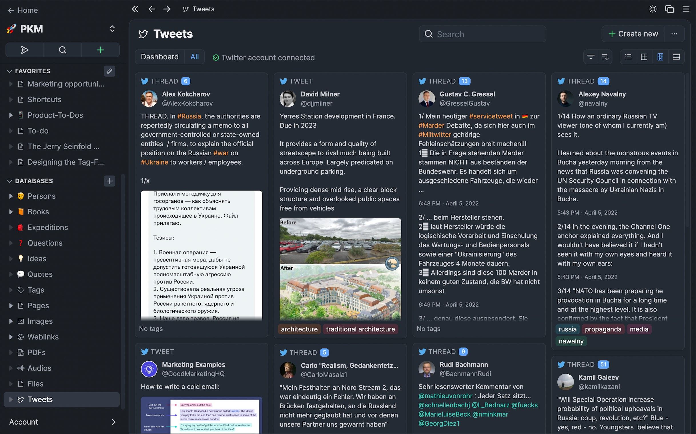
The most significant aspect we changed is lifting the content above the rest of the user interface. The content is the center of your work, which is now deeply rooted in the user interface. We don't want to distract our users by treating sidebars and secondary UI elements the same way as the content itself.
Your content is the center of everything.
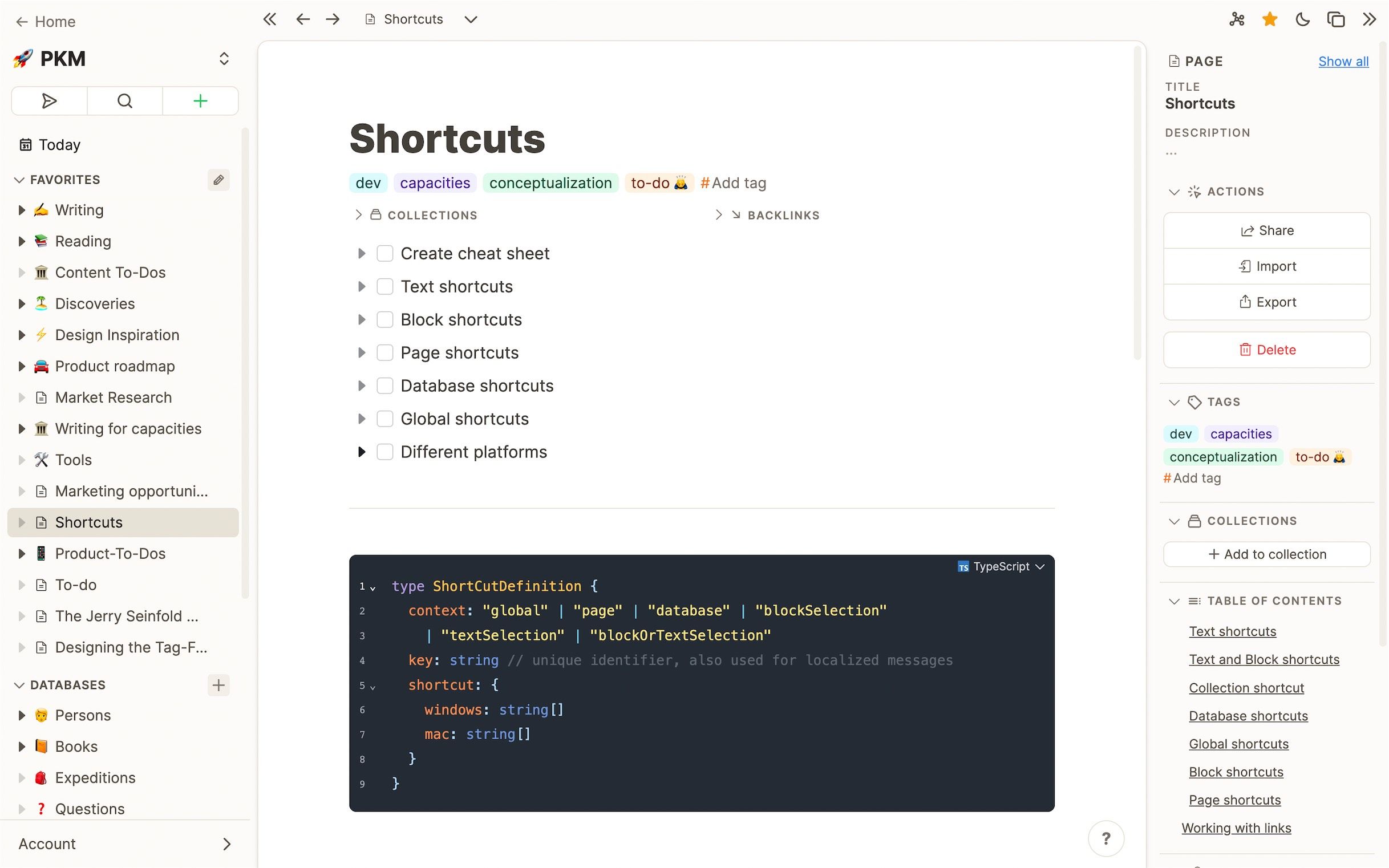
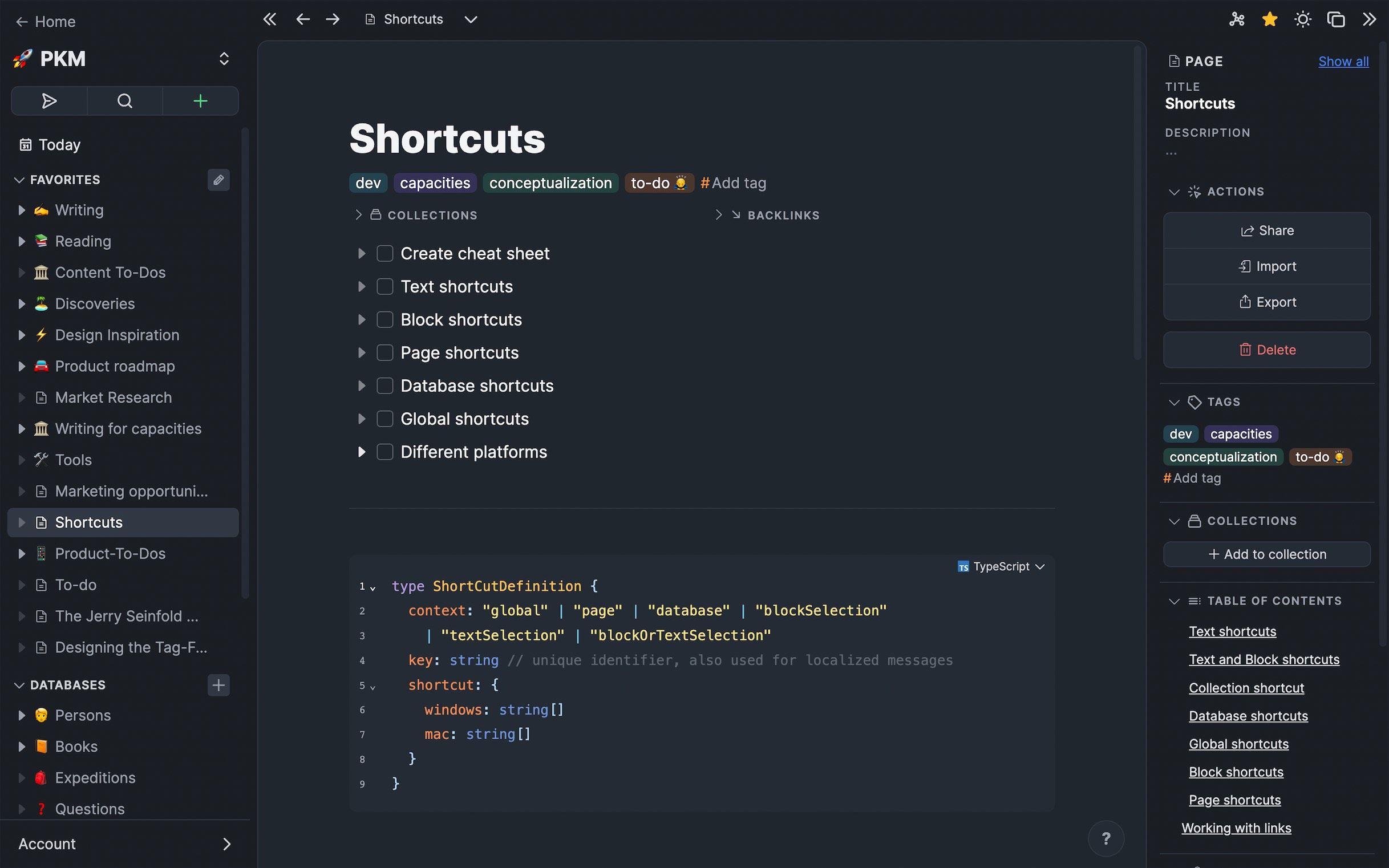
We created friendly, rounded-lg corners around the main content panel, set it apart with a small margin and lifted it up with 1) a shadow and 2) by giving the surrounding area a slightly darker background. The effect of this is striking. It subconsciously puts the primary content into the center of you attention and creates a much calmer, more focused working environment.
Screenshot of page in dark mode. Shadows don't really work in dark mode so the contrast with the background is stronger.
Smooth, rounded-lg corners create a friendlier interface for thinking.
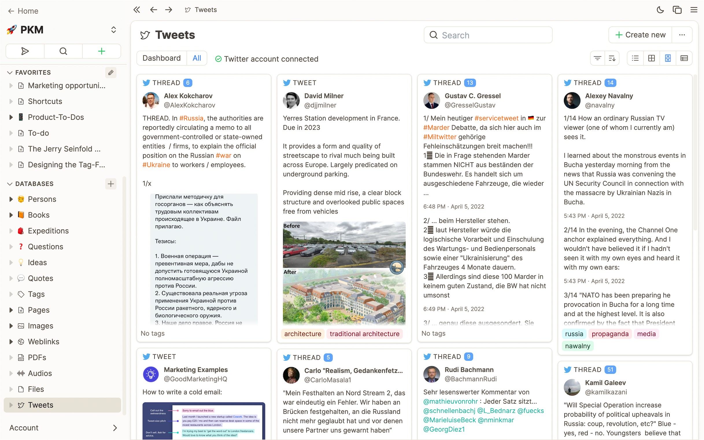
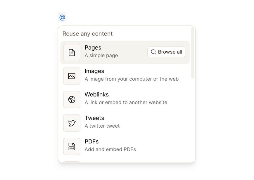
We did not only add more roundedness to the main content panel but also to several other elements such as dropdown items and cards. This again makes the app friendlier and overall more pleasant to work with.
Example of our main dropdown to reuse content.
Metaphors are still important in UI design.
A paper on a desk is still something many of us feel a deep connection with – and reminds us of deep and focused work. We want to bring the same feeling to our users when they are building and cultivating their knowledge.
Less lines and separators
We realized that too many lines in our UI were distracting and moved attention away from the actual content. So we tried to remove as many lines as possible and leave them only when they were both visually appealing and contributing to the understanding of the user interface and information architecture.
Combining calm surfaces with colorful accents.
We kept our calm, gray surfaces but tried to combine them with more colorful accents in several areas. Examples for this are tags, which initially get a random color.
Color accents in dark mode.
Colors should be semantic where possible
Since we don't use to many intense colors in the app, we try to use colors to convey a certain meaning that helps the user understand the user interface better. This is also referred to as semantic coloring. Below are some examples.
Creation of new content is color-coded in green.
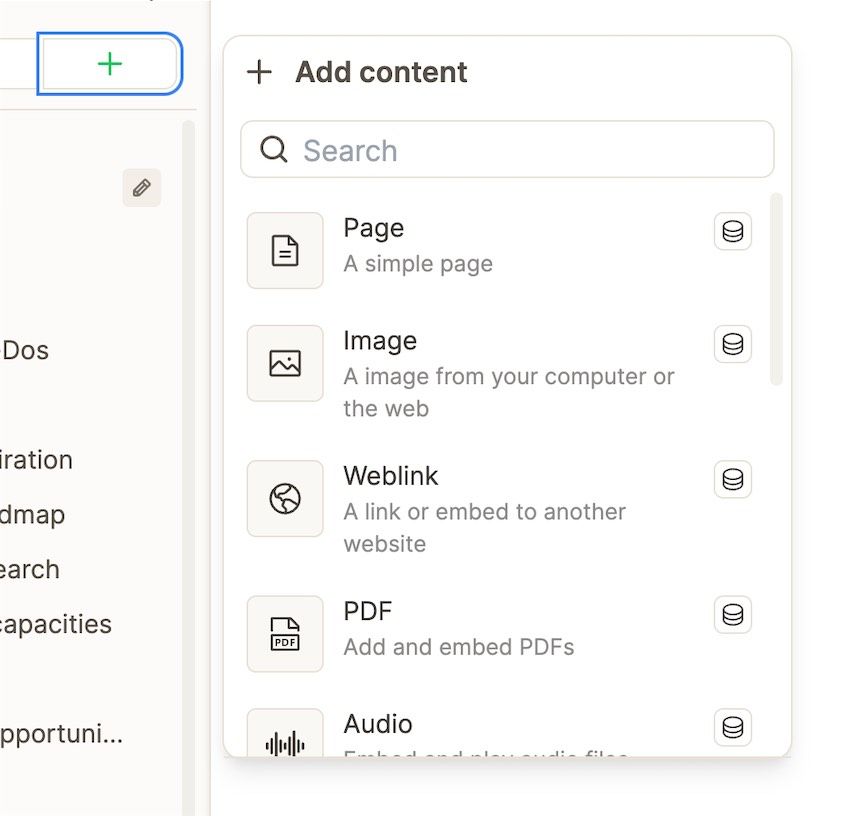
Reuse is color-coded in blue
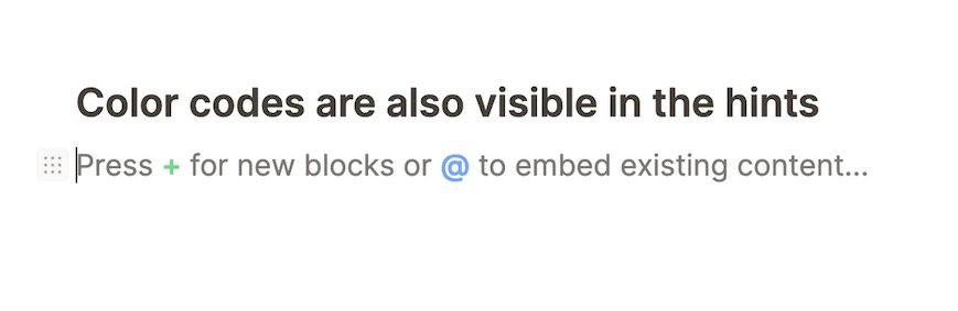
Color codes are also visible in the hints
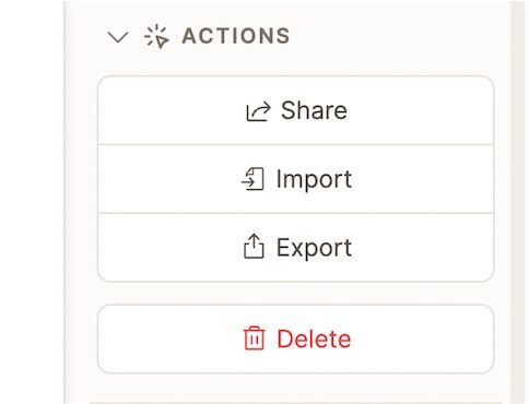
Delete actions are color-coded in red.
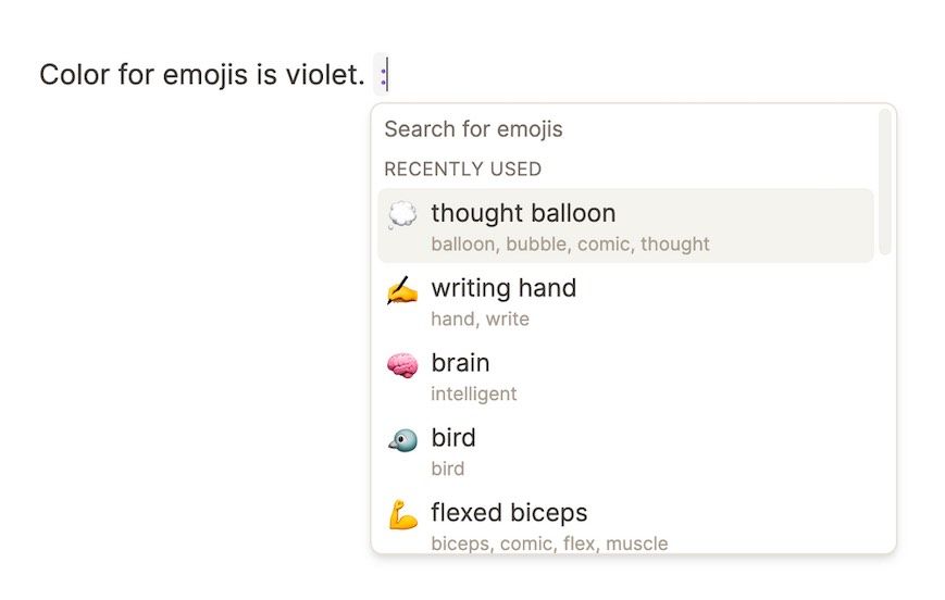
Color for emojis is violet.
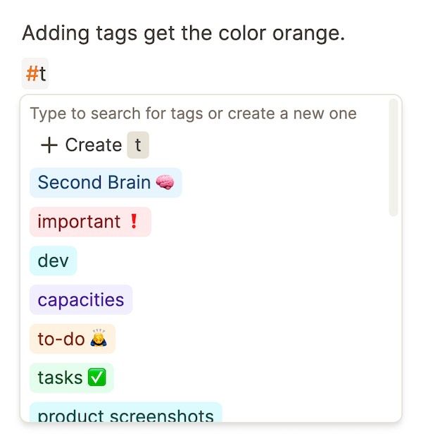
Adding tags get the color orange.
That's it for this post.
Stay tuned for another one and make sure to follow @capacitiesHQ, my co-founder @steffeBle and me @MvHohnhorst on Twitter.
And have a look at the new design yourself.

Related articles
How to create the knowledge base for your life
By combining two approaches from personal knowledge management we can create a powerful second brain.
 Steffen
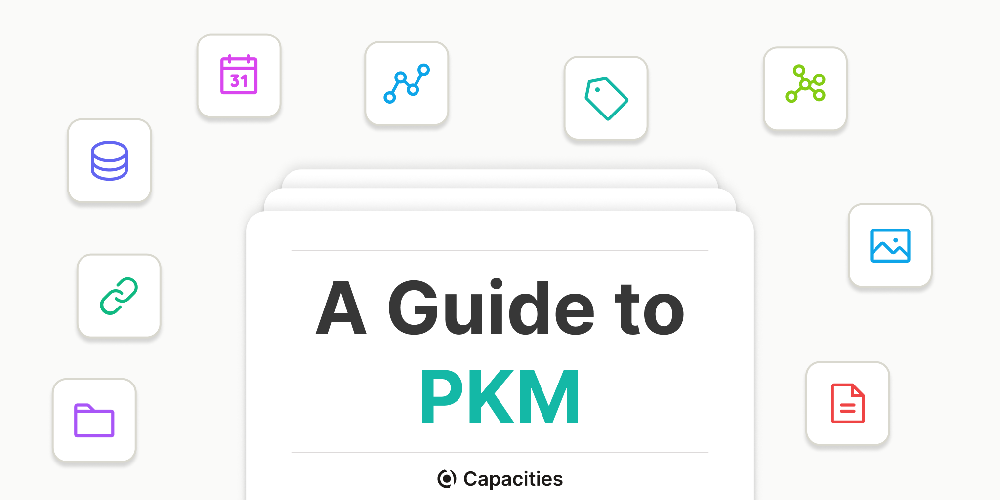
A Guide to Personal Knowledge Management with Capacities
In this guide, we will show you how to do PKM with Capacities. We'll explain different concepts and show you how to create your workflow in Capacities.
 Michael
Ready to organize your mind?
Join thousands of thinkers who use Capacities to capture and connect their ideas.